


![]()
Modern newspapers are overflowing with charts. The New York Times, Washington Post and Wall Street Journal dedicate immense resources to making graphics for both their print and online editions.
But it was not always so.
The New York Times was first published in 1851. From nearly the beginning of its existence, the Times brimmed with data like stock prices, weather statistics, and sports scores. But for the first century of publication, the use of charts to display that data was rare.
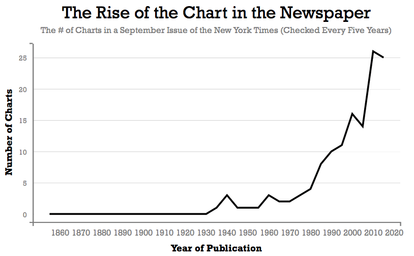
In order to understand when charts started appearing in papers, we collected data on the number of charts in editions of the New York Times over its history. We checked a weekday, September edition of the paper every five years from 1855 to 2015. We chose the Times because of its rich archives and because we found it to be representative of trends in the newspaper industry.
Source: New York Times
Methodological Note: We chose the paper closest to September 13 in each year that was not a Sunday or Monday. The stock market—an important possible source of charts—is closed preceding those days. We manually counted the charts.
Though statistical graphics were already in fairly common use by the turn of the 19th Century, the pre-1930 editions we examined had exactly zero charts. Every paper since 1930 has had at least one chart, and the 2010 and 2015 editions each included more than twenty.
The chart is now accepted as an integral tool for journalism. What took so long?
The Dark Ages (1930 and Before)
The modern statistical chart was invented by the Scottish political economist William Playfair at the end of the 18th Century. In a fit of astonishing innovation from 1786 to 1801, Playfair made the first known bar chart, line chart, and pie chart.
Historians believe that Playfair’s development of the statistical chart was a response to the surge in the availability of economic and demographic data collected by governments. Suddenly, efficient ways to express all this information were necessary. The chart filled that need.
Playfair’s data visualizations did not quickly catch on. They were initially considered childish by serious academics.

William Playfair created the first known line chart in 1786.
The use of statistical graphics did not proliferate in Playfair’s lifetime—he died in 1823. But by the beginning of the 20th Century, graphical representations of data were common in textbooks and used by governments, financiers, and scientists. Both the French and American governments annually published statistical atlases filled with charts that aimed to explain the world.
Yet charts were nowhere to be seen in the newspaper.
There were lots of statistics in the paper. Journalists wrote about trends in the bond markets, activity in the commodity markets, and changing birth rates. Numbers were a big part of the media; they just weren’t visualized.
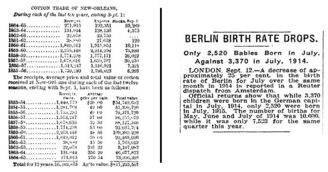
This table from on cotton trade data from 1865 and story on birth rates from 1915 would certainly be candidates for visualization today.
Given the vast amounts of data in the paper, why the rarity of charts?
There is little academic research on the subject, but the most likely explanation is a combination of technological hurdles and the public’s unfamiliarity with statistical graphics.
Making charts in the first half of the 20th Century meant hand drawing them—with a little help from primitive technology. Chart makers’ main tools were rulers, graph paper, and compass pens. Journalists did not make charts without seriously considering whether it was worth the time.
When newspapers did choose to publish a chart, the average person might not understand it. Though data visualization was common in academia, government, and science, the average person was not accustomed to interpreting charts. Charts were still such a rarity in the early part of the 20th Century that in 1913 there was a “parade of statistical graphics” in New York City .
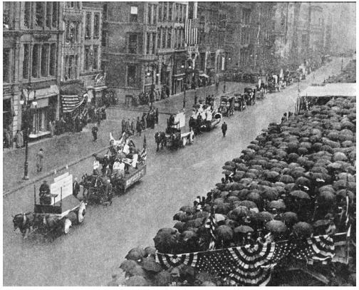
Charts were such a novelty in 1913 that there was a parade of statistical graphics.
The Business Chart Era (1930s-1970s)
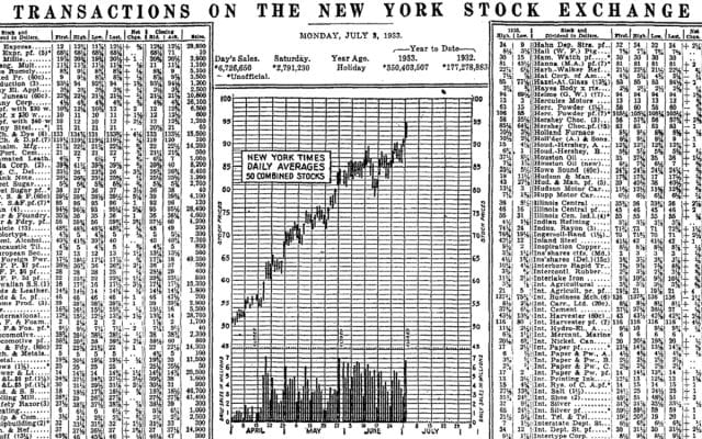
July 4, 1933, is arguably the day that data visualization became a permanent part of mainstream media.
On that day, with no fanfare, our analysis suggests that the New York Times published a stock market line chart for the very first time. A stock market line chart is that most famous of graphics that shows trends in the performance of an index of stocks over a given period.
Charts did appear in the Times prior to that day, but inconsistently. Some days the paper contained no charts at all. But since July 4, 1933, the Times has published a data visualization almost every Tuesday through Saturday. (The markets are closed on Saturday and Sunday, so there is no chart the following day.) We also checked the archives of the LA Times and San Francisco Chronicle, and neither published a stock market line chart before July 4, 1933. The LA Times was also already periodically publishing charts.
The first stock market line chart published in the New York Times was in 1933.
Even after the Times began regularly publishing data visualizations, they were not spread evenly throughout the paper. From the 1930s to the 1970s, the preponderance of charts appeared in the Business section.
More specifically, the vast majority of mid-century newspaper graphics were line charts showing commercial trends like changes in the stock market, the production of automobiles, or the amount of electricity produced. It’s probably no coincidence that these charts became common during the Great Depression—when the economic health of the United States weighed heavily on the minds of Times readers.
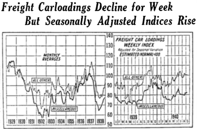
This chart from a 1940 edition of the New York Times shows trends in the production of freight carloading. Most of the charts found in the New York Times in the 1930s to 1970s displayed economic and business trends.
The fact that the business section was the earliest home of the chart is not a surprise. Business and economics has always been at the forefront of statistical graphics, and the economy produces lots of statistical data. The business-focused Wall Street Journal was already publishing charts in the early 1920s.
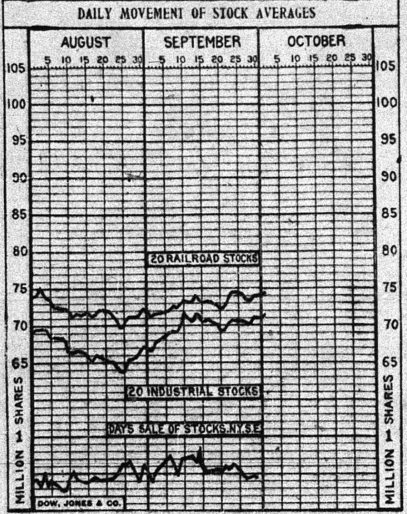
A chart from a 1921 edition of the Wall Street Journal.
Even today, most Times’ charts are in the Business section—18 of 25 for the September 16, 2015 edition. This phenomenon can be observed across the media spectrum (i.e. The Economist publishes a lot more charts than The New Yorker).
While most of the graphics in the Times during this period were simple line charts, there were some more complex visualizations. The following chart from a 1960 edition of the Times is an early version of a lattice graphic—side by side displays of the same information for different groups. Inventive charts like this one were a sign of things to come.
Most early charts in the newspaper were simple line charts, but more complex graphics, like this one from 1960, sometimes appeared.
Computerization and the Rise of the Non-Business Chart (1980s-2000s)
The seeds of the newspaper chart explosion at the end of the 20th century were sewn in the offices of IBM and Bell Labs decades earlier.
In the 1950s and 60s, engineers developed computer programming languages for the processing of statistical data (FORTRAN and S) and programs that simplified data visualization (SAS and Lisp-Stat). These new tools for data analysis and visualization were only comprehensible to a small number of programmers. By the 1980s, however, software programs—like Lotus 1-2-3 and Microsoft Excel—were created and allowed more people to easily make charts. Instead of hand drawing charts or using complicated graphic terminals, journalists could now produce charts on personal computers.

Before personal computers, newspapers used graphics terminals to make charts.
From 1950 to 1975, the newspapers we examined averaged only two charts per edition. From 1980 to 2005, this number increased to over 10.
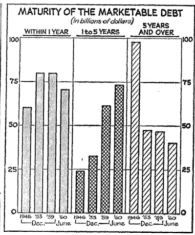
The look of the charts in the Times also changed with computerization. The following chart from a 1980 issue of the Times has a similar crispness to modern data visualization.
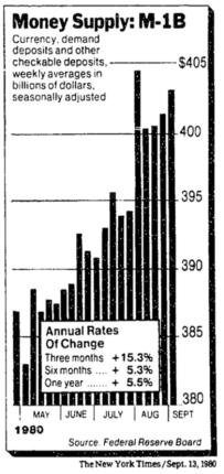
This chart from 1980 looks similar to what we find in papers today.
Data visualization sophisticates might notice that the bar chart above exhibits one of the great faux pas of good data visualization: The y-axis begins at 380, rather than at zero. This misleads the undiscriminating reader about the magnitude of the trend displayed by the chart.
In the 1980s and 1990s, the Times was full of examples of what is now considered poor chart making. For example, the 1995 chart below shows that the Times was not immune to the peculiar desire of many chart makers to make their visuals 3-D (which obscures the reader’s ability to comprehend the data).
The New York Times was not immune to making their charts 3-D and thus more challenging to read.
As charts became easier to make and more widely understood, their use spread throughout the paper.
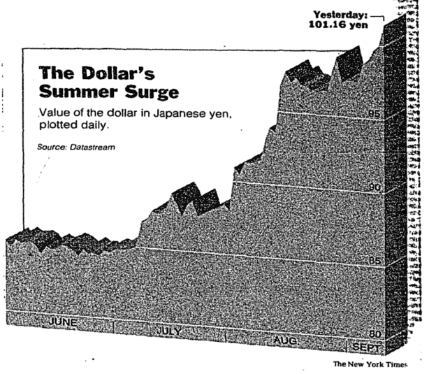
In our sample of Times pieces, we only found one chart used outside the Business section before 1990. But starting in 1990, each of the issues we checked had at least one chart outside the Business section. For example, the September 13, 1990, edition of the Times had the following charts in the Metro and Health sections.
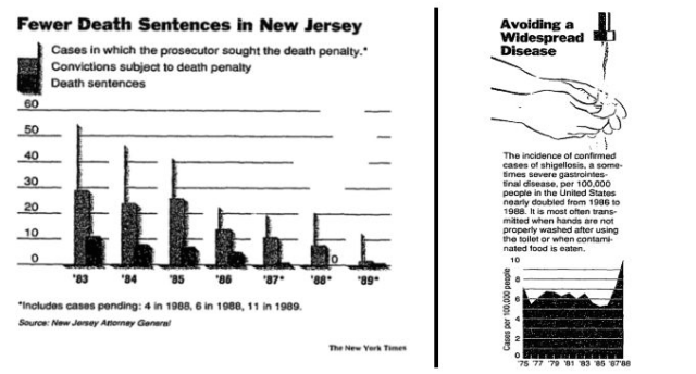
Starting in the 1990s, charts were regularly found outside the business section.
The Modern Era (Late 2000s to Today)
By the late 2000s, charts had become central to the journalism at the Times. The newspaper had a team of graphics reporters infusing the paper with innovative visualizations. For the Times web edition, those data visualizations were often interactive.
The following “stained glass window” style chart from 2008 shows how sophisticated visual journalism became. The chart displays inflation over the past year by expense types. Web readers could hover over different parts of the image to get additional information.
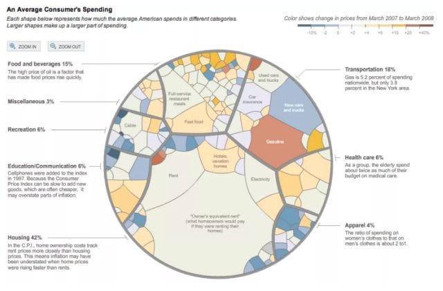
By 2008, the data visualization in the New York Times was complex and interactive.
The Times has been at the vanguard of making complex statistical graphics, but the Washington Post, USA Today, and Los Angeles Times have also committed significant resources to data visualization over the last decade.
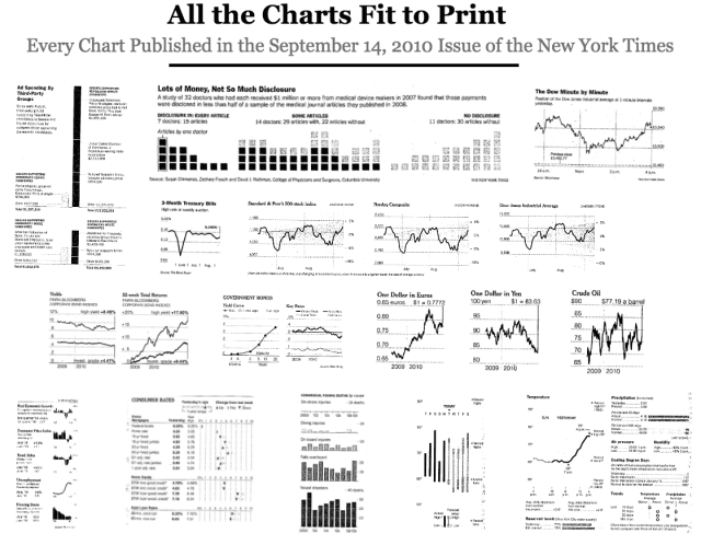
Not only did newspaper charts become more complex, they became more common. The September, 14, 2010, edition of the New York Times had 26 different charts, seven of which were outside the business section. The following image shows every chart in that print edition of the paper.
***
The New York Times cemented their prioritization of visual journalism when they launched the data-driven news site the Upshot in 2014. The Upshot’s original team of fifteen included three full-time graphic journalists. Amanda Cox, the site’s current editor, started at the Times in 2004 as a graphics reporter.
Today, it is not unusual for an Upshot graphic to occupy the most prominent space on the front page of the New York Times website. Readers checking the site on the morning of September 9, 2016, were greeted by a variation on a bar chart comparing the growth in murder rates across cities.
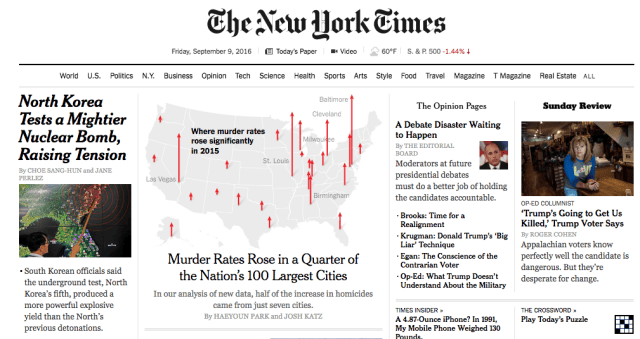
The front page of the New York Times website on the morning of September 9, 2016 was dominated by a statistical graphic.
Over the course of the last century, the chart has gone from obscure academic tool to a mainstay of the front page. This revolution in data visualization came about thanks largely to better technology and more accessible data. These days, a newspaper without a chart would barely feel like a newspaper at all.
Our next article investigates why a company might pay Malcolm Gladwell, Mike Ditka, or Hillary Clinton $40,000 to $250,000 for a speech. To get notified when we post it → join our email list.
![]()
Announcement: The Priceonomics Content Marketing Conference is on November 1 in San Francisco. Get your early bird ticket now.