Source: Ben Schmidt Flickr series
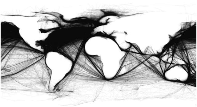
What do you get when you map the coordinates of thousands and thousands of ships from their logs and journals? A world map unlike any other.
The above map comes from Ben Schmidt, an assistant professor of history at Northeastern University with an interest in digital humanities. Working with the International Comprehensive Ocean-Atmosphere Data Set, Schmidt created maps like the one above, which went viral among communities interested in data visualizations and eventually mainstream press.
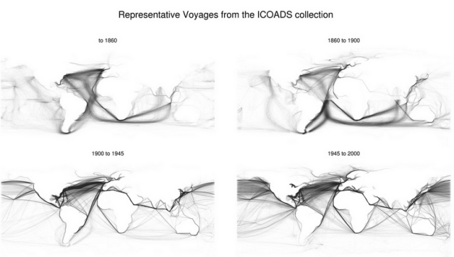
One interesting application, focused on by Quartz, is how maps based on data sets from different time periods reveal the development of global trade and modern sea lanes. Over time, the maps show increased trans-Pacific trade, trade through the Suez Canal, and so on.

Source: Ben Schmidt Flickr series
It’s a powerful example of the contributions digital analysis is ready to make to historical analysis. Data fans can root for exercises like this one to liven up stuffy history departments. But while busy mapping shipping data in R (a programming language), Schmidt writes that “Digitization makes the most traditional forms of humanistic scholarship more necessary, not less.”
Schmidt clarifies that the maps from each time period are not perfect analogues of each other. He stresses the biases of each data set based on the reason it was collected. His original map of 1860 shipping, for example, came from a data set of American ships that was 1/4 whaling ships. Why so many whaling ships? Because the collector of the records had an interest in whaling ships since they traveled to more “exotic locations.”
Schmidt writes of the problem of doing history with data sets:
Humanists and scientists alike, trained in the language of survey research, tend to ask of data sets: “Is it a representative sample?” I doubt there is a single dataset of interest to historians that is. But while attempting to normalize away the biases in a sample is the best scientific solution to the problem, the humanistic approach is to understand a source through its biases without expecting it to yield definitive results.
Not that the people sharing the maps really care. The maps’ appeal is their striking visuals and the way that human activity reveals the map with which we are all so familiar. The lines from the ship logs reveal the ghostly contours of the continents like fingerprints revealed by a detective dusting a crime scene.
To get occasional notifications when we write blog posts, sign up for our email list.


