Whenever we make graphs using Excel, they turn out pretty ugly. But, actually Excel charts don’t have to be ugly. While the default options provided by Excel are downright hideous, you can clean them up with a few tricks. You can check out a primer to making your charts more appealing here.
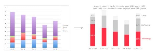
Here’s the before and after of the same chart. The first version is the default version that Excel gives you. The second is after doing some magic to it.

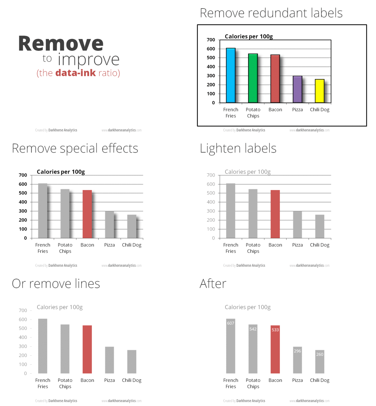
For those of you under the age of 15 that prefer seeing things in GIF format, here are some tips from Darkhorse Analytics that show the general process of making your charts look presentable.

To get occasional notifications when we write blog posts, sign up for our email list.


