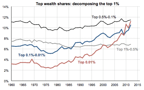
Saez and Zucman, “The Distribution of US Wealth” (pdf)
According to economists Gabriel Zucman and Emmanuel Saez, the Occupy Wall Street crowd was off by a few decimal points. They complained about the 1%, but they really meant to denounce the .01%.
When Occupy protesters labelled themselves the 99%, they cast America’s richest 1% as villains. The top 1% were America’s “haves” — the people whose greed caused the financial crisis while the have-nots footed the bill. The 1% were bankers and CEOs whose compensation had increased dramatically even as the wages of the average American worker stagnated. It was a new gilded age, à la Great Gatsby and the 1920s.
The “We are the 99%” motto held economic water, and 2011 became the year of income and wealth inequality graphs. They showed flat wages and stagnant wealth since 1979 for all but the 1%, whose fortunes reached for the top of the charts. And they showed the rich’s share of income and wealth plummeting from its Roaring Twenties peak during the Great Depression, falling in the post war period through the seventies, and then rallying back from the 1980s to today.
But as shown by the graph at the start of this post, which breaks down the gains in wealth among America’s wealthiest households, the story is not the 1%. The 1% saw their share of the nation’s wealth increase, but that increase was driven by the top 0.1% and even the top 0.01%. In contrast, the top 1%-0.1% saw almost no increase in their wealth. (And we see a similar effect when looking at income among the 1%.)
The 99.9% and the 0.1% may not be as catchy, but the adjustment fits Occupy’s story much better. When protesters derided the 1%, they spoke about Wall Street and big time CEOs. But at $370,000 in annual income, the cutoff for the 1% included some poorly cast villains. A New York Times piece on the 1% featured a couple, both doctors, one of whom was still paying off student loans. Doctors make good money. But while no one will protest for them, doctors may have more of a right than anyone to complain about a fixed system. After all, the only way to become a doctor is to first work as a resident and make $40,000 to $50,000 for 80 plus hours of work a week.
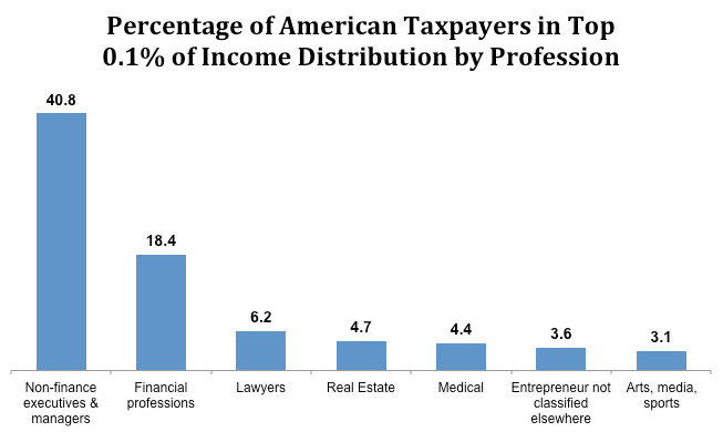
As Paul Krugman points out, the 0.1% is a much less diverse group. He cites the below data to describe them as “corporate suits, with a few token sports and film stars thrown in.”

Data source: Bakija, Heim, and Cole, “Jobs and Income Growth of Top Earners” (pdf). As income here is based on tax return data that includes capital gains tax, it does a solid if imperfect job at identifying America’s richest households.
On the question of what percentage of Americans exactly the rest of the country should blame for inequality, the answer is getting more precise.
This post was written by Alex Mayyasi. Follow him on Twitter here or Google Plus. To get occasional notifications when we write blog posts, sign up for our email list.


