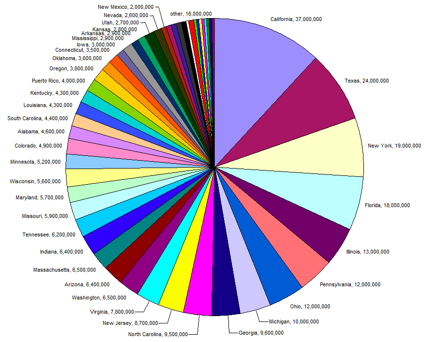
“In a sense, it might be construed as an insult to a man’s intelligence to show him a pie chart.”
K.G. Karsten, Charts and Graphs (1923)
***
The assault on the pie chart began over a century ago.
In 1914, the engineer and visualization advocate Willard Brinton published Graphic Methods, which is considered the first book about proper data visualization for a general audience. He was the Edward Tufte of his day: an evangelist for the value of communicating information visually, and a lampooner of bad examples of the form.
A significant portion of Brinton’s book cautions against the use of the pie chart. In the very first chapter, on representing “component parts,” Brinton explained:
[The Pie Chart] is used probably more widely than any other form to show component parts. The circle with sectors is not a desirable form of presentation, however, because it does not have nearly such flexibility as [bars]… [a] disadvantage of the sector method is the impossibility of placing figures in such manner that they can be easily compared or added.
Since Brinton wrote those words, multitudes of statisticians and visualization experts have attacked the pie chart and pushed for the use of alternatives. Though early criticism primarily appealed to logic, in the last 40 years, pie chart critics have marshaled experimental evidence that seems to demonstrate the inferiority of pie charts at accurately conveying information.
Yet the pie chart is remarkably resilient. Major publications and businesses, like The Wall Street Journal and the Target Corporation, still use the pie chart to display data. Even this very website has occasionally used the controversial charting method.
To understand this denigrated chart, we look back to its origins and the arguments of pie chart critics and defenders.
***
The pie chart is among the many innovations of Scottish “rogue” William Playfair.
William Playfair is the father of modern data visualization. Born in Enlightenment Scotland in 1759, Playfair lived an incredibly varied life. He stormed the Bastille, contributed to the development of the telegraph, and yes, published the earliest known pie chart. He is also the inventor of the bar chart and line chart.
At the turn of the 18th century, the use of illustration in serious intellectual writing was considered childish. But as a freethinking spirit, Playfair would not be deterred. In 1801, Playfair published the Statistical Breviary, a book focused on displaying demographic and economic data about European countries. In this book, which contains the first pie chart, Playfair argued for the value of his visuals. “Making an appeal to the eye when proportion and magnitude are concerned,” he wrote, “is the best and readiest method of conveying a distinct idea.”
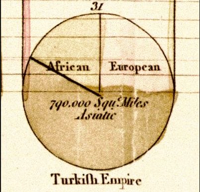
The pie chart that appears in the “Statistical Breviary” is shown below. It depicts the proportion of the Turkish Empire’s land area located in Asia, Africa and Europe at that time. It is generally considered the first pie chart to represent data as a proportion of a whole in a circle, as well as the first time color was used to differentiate the components.
This breakdown of the proportion of the Turkish Empire is one of the first known pie charts.
How did Playfair come up with such an idea?
Some scholars believe the pie chart may have been inspired by the use of circles in representing concepts in philosophy and mathematics. Playfair’s brother John was a highly regarded Enlightenment mathematician and scientist. It is likely that through John, William saw a divided circle used to display the component parts of a category. Mathematicians and philosophers used this type of illustration as far back as the 14th Century.
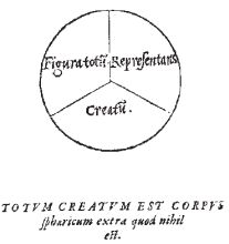
A 14th Century use of the a divided circle to represent the component parts.
The pie chart, and Playfair’s other data visualization innovations, did not catch on quickly. Considered a “rogue” and businessman of low morals, Playfair’s ideas were generally dismissed.
It was not until the 1850s that the pie chart gained another major champion, when the French civil engineer Charles Joseph-Minard sparked the pie chart’s assent. Minard was a “pioneer” in statistical graphics and the creator of what many consider some of the most beautiful and ingenious data visualization ever made. (This author certainly thinks so.)
Primarily a cartographer, Minard would incorporate pie charts, which are sometimes called camembert charts in French, into his maps. Perhaps most famously, in the map displayed below, he used the pie chart to visualize the amount of meat supplied to Parisian markets from different departments of France (departments are similar to American counties). The size of the circle represents the total amount of meat, and each circle is divided proportionally by how much of the meat is mutton, beef and veal.
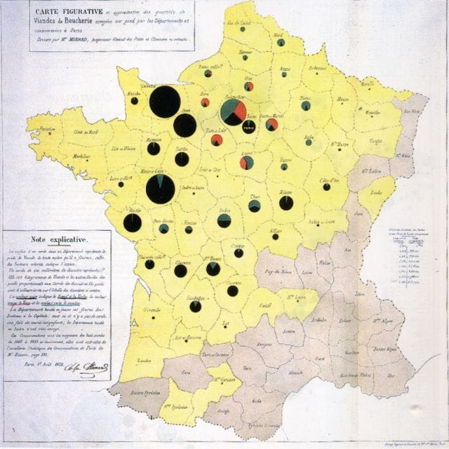
An 1858 map by data visualization pioneer Charles Joseph-Minard utilizing pie charts.
The legendary English nurse and social reformer Florence Nightingale is sometimes erroneously credited with inventing the pie chart. In 1858, Nightingale charted the causes of mortality for British soldiers in the Crimean War by month. She used this chart to lobby the British government to improve sanitation conditions and nutrition in the war camps.
Though incredibly powerful and influential, her chart is actually not a pie chart. It is what is called a polar-area diagram, in which the pie is divided evenly but made longer depending on the size of a certain variable.

Florence Nightingale’s polar-area chart is often confused for a pie chart.
***
The first 100 years of the pie chart were a time of peace, but a storm was brewing. Brinton’s criticism of the pie chart, discussed at the beginning of this article, is the earliest popularly known critique. By the 1920s, a growing literature had emerged that assailed the pie chart.
In 1923, the American economist Karl G. Karsten followed Brinton in warning against the pie chart. Karsten’s claims in his book Charts and Graphs are remarkably similar to those heard today:
The disadvantages of the pie chart are many. It is worthless for study and research purposes. In the first place the human eye cannot easily compare as to length the various arcs about the circle, lying as they do in different directions. In the second place, the human eye is not naturally skilled in comparing angles… In the third place, the human eye is not an expert judge of comparative sizes or areas, especially those as irregular as the segments of parts of the circle. There is no way by which the parts of this round unit can be compared so accurately and quickly as the parts of a straight line or bar.
Though the attacks on the pie chart were mounting, the statistician Walter Crosby Eells noted in 1926 that all of the criticisms seemed to be “purely matters of opinion.” Eells and others set out to test this assumption.
Early studies focused on whether people more accurately guessed the proportions of divided circles or bar. For example, in a 1927 experiment conducted by Frederick Croxton and Roy Stryker, the researchers asked over 800 subjects to guess the proportion of each component of a variety of segmented bars and circles. An example from the article is below:
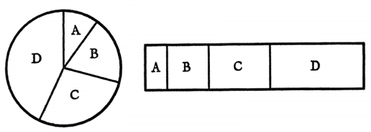
In this case, the proportions are actually identical.
The researchers calculated the average error of the subjects’ guesses. In this experiment and others, researchers did not find strong evidence against the pie chart. Defenders of the pie chart still use the results from these early studies to argue their case.
But, as the researcher Michael Macdonald-Ross pointed out in a comprehensive review of what he calls the “Bar and Circle Controversy,” these initial experiments are not really relevant. Although the segmented bar was at that time considered the primary alternative to the pie, today, practitioners almost universally suggest using a bar chart or dot plots.
The pie chart received perhaps its greatest and most long lasting blow in the 1980s at the hands of the statistician William Cleveland. Cleveland is the author of The Elements of Graphing Data and his groundbreaking work on how people perceive charts is credited by many as giving data visualization its scientific foundation. His work detailed the basic “perceptual tasks” involved in looking at a chart, like judging length or area, and assessed through experiment which of these tasks people are best at.
In a seminal paper in 1984, Cleveland and his fellow researcher Robert McGill put pie charts to the test. Instead of testing the pie chart against the segmented bar, they compared the pie chart’s strengths to those of its true rival, the bar chart. The following pie chart and bar chart, which depict the same data, are the images that subjects were asked to assess:

In Cleveland’s paradigm, the perceptual task associated with a bar chart is judging position on a scale, and the task associated with a pie chart is judging angle. They found that the length judgments for the bar chart were “1.96 times as accurate as angle judgments” for a pie chart. In later writings, Cleveland explained, “Pie charts do not provide efficient detection of geometric objects that convey information about differences of values.”
The statistician Naomi Robbins has since explored why we struggle to judge angles. In Creating More Effective Graphs, she explains that, in general, people “underestimate acute angles (angles less than 90°) and overestimate obtuse angles (angles greater than 90°).” She also shows that slices that angle out to the sides (like slice C, above) appear larger than slices that angle out to the bottom or top.
This research has emboldened pie chart haters. Today’s leading data visualization experts like Edward Tufte and Stephen Few dislike pie chart. Tufte writes that “A table is nearly always better than a dumb pie chart”, and in a long screed against the pie, Few admonishes data visualizers to “save the pies for dessert.”
The pie chart has also been rebuked in popular media. The Washington Post and New York Times have both published takedowns.
A pie chart attacking the usefulness of the pie chart; Washington Post
***
Yet the pie chart is not without its defenders.
The main attraction to many users of the pie chart is the chart’s implicit suggestion that the slices are part of a whole. A reader looking at a pie chart of the American population divided into age groups, for example, will likely assume that that the data is made up of the entire population. This assumption that the data is representing a whole will not be as obvious with a bar chart.
Some academics also dispute the empirical literature that judges the pie chart so harshly. Perhaps no individual has spent more time making the case for the pie chart than the psychologist Ian Spence. Spence’s “No Humble Pie: The Origins and Usage of a Statistical Chart” is a full-throated defense of the beleaguered visual.
Spence believes the studies of people’s understanding of pie charts are generally poorly designed. He views Cleveland’s work as flawed because it asks people to compare the sizes of different slices of a pie, rather than assess what proportion a slice is of the whole. In his view, pies are most often used for the latter purpose. Citing a 1987 study, Spence claims that pies are the equal of bars for this purpose. He writes:
“In my opinion, much of the adverse criticism of the pie has come from those who have wished it to do more than it could. The pie chart is a simple information graphic whose principal purpose is to show the relationship of a part to the whole.”
A 2013 study on the mental energy used for decoding pie charts and bar charts offers pie defenders more ammo. The study from researchers at Tufts University used functional near-infrared spectroscopy (fNIRS) to measure the mental energy used by subjects when looking at different charts. The authors found that pie charts were no less accurately assessed and that the average person did not find them more mentally exhausting to decipher than bar charts.
In a criticism of this study, Stephen Few contends the claims made by the researcher are faulty and irresponsible. The experiment tested people’s ability to make assessments across separate pie and bar charts not within the same chart. Few asserts that this is not actually what people are asked to do when looking at these charts, so this study is of little importance.
Others believe the pie chart can be useful when it is used sparingly and for aesthetic purposes. Nathan Yau of Flowing Data points out that even if the angle judgments associated with pie charts are worse than other chart types, the judgments are not so much worse that it should never be used (particularly when there are only two values to portray). In certain circumstances, design considerations may make pie charts the best choice.
It may not be useful for displaying data, but there sure is a lot of good pie chart humor
***
Even after a century of attacks, the pie chart doesn’t seem to be going anywhere.
Although a great deal of energy has been put towards condemning and justifying the chart, as far as we know, little work has been done to understand the lasting appeal of the pie. Perhaps it is simply because it is the first chart type students are exposed to, or because people love circles. Or maybe we should blame Microsoft for highlighting them in Excel.
Another possible reason for the continued life of pie charts is that proper data visualization is rarely taught in high school or even college. This author studied economics and statistics up to a graduate level, and never once encountered a class in which proper data presentation was discussed.
With the growing recognition of the centrality of data and statistics in modern life and work, the grammar of data visualization may demand more attention. Already, many are advocating for statistics to be a requisite class for high school students. As statistics, and thus data visualization, becomes more ubiquitous, the pie chart may finally receive its death knell.
For our next post we take to the streets of San Francisco to determine the prices of various drugs. To get notified when we post it → join our email list.
![]()
This post was written by Dan Kopf; follow him on Twitter here.


