


Still from Jupiter Rising an upcoming scifi thriller
Maybe you haven’t noticed, but in the past 20-or-so years there’s been a real catchy trend in major Hollywood movies to constrain the palette to orange and blue. The color scheme, also known as “orange and teal” or “amber and teal” is the scourge of film critics – one of whom calls this era of cinema a “dark age.”
You’re probably skeptical, so check out the following. Warning that once you know what to look for, it will be very difficult for you not to notice see this color scheme every time you look at a screen, at least for a little while:
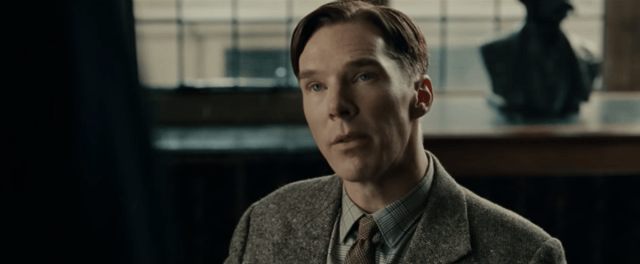
Still from The Imitation Game (2014) a historical biopic about Alan Turing

Still from Into the Woods (2014) a fantasy musical

Still from The Wolf of Wall Street (2013)

This still from the Mad Max (2015) trailer looks a little yellower than the preceding three. But it’s also a much more intense scene. And still undeniably orange and blue.
And then, of course, there’s every movie poster ever. Because they need to be flashy, they’re a lot brighter and more saturated. But they’re still on the whole very orange and blue:

Orange and blue contrast movie posters from TV Tropes
It isn’t every scene, in every movie. Some films, and some filmmakers, tend towards novel color schemes. But the rest tend towards orange and blue. The trend was already in full force a few years ago, when a blogger sampled the colors in a bunch of film trailers. This is what he came up with: 
Edmund Helmer’s 2013 analysis of film trailers
It’s like the Emerald City, except instead of making us wear green-tinted glasses, the current Hollywood wizard mutes green…along with every other color on the spectrum that isn’t orange or blue.
Digital Colorization

The Wizard of Oz seems to predate this trend.
What the hell is going on? Well, back in the day, the colors projected on the silver screen depended first on how you shot and developed the actual, physical film, and then whether or not you had somebody go through and painstakingly, expensively apply more colors to every frame.
Now, most movies are shot digitally and it’s a lot easier to go back and rebalance things to achieve whatever affect you want. But someone still needs to actually do it. And if it doesn’t look good, that person gets in trouble.
O’ Brother Where Art Thou (2000) gets referenced a lot as an early movie to heavily digitally color grade. The Coens reportedly wanted it to look retrograde at the expense of realism, which is why it was graded so heavily: the entire movie is a nice warm sepia. The cinematographer on the film has said, “They wanted it to look like an old hand-tinted picture, with the intensity of colors dictated by the scene and natural skin tones that were all shades of the rainbow.”
But how did we get from “all the shades of the rainbow” to “orange”?
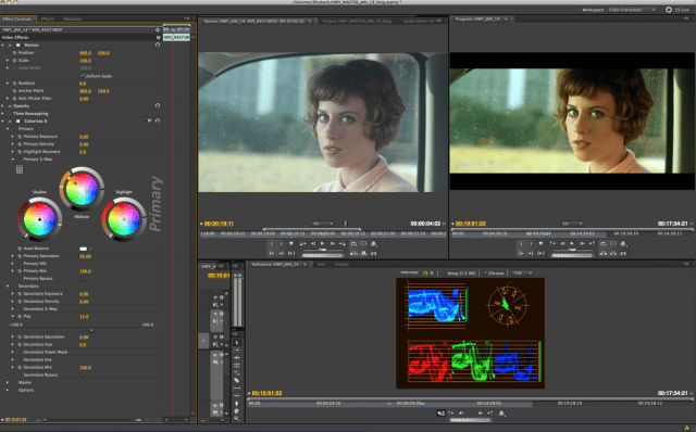
Adobe video editing software
The big change that digitization made was it made it much easier to apply a single color scheme to a bunch of different scenes at once. The more of a movie you can make look good with a single scheme, the less work you have to do. Also, as filmmakers are bringing many different film formats together in a single movie, applying a uniform color scheme helps tie them together.
One way to figure out what will look good is to figure out what the common denominator is in the majority of your scenes. And it turns out that actors are in most scenes. And actors are usually human. And humans are orange, at least sort of!
Most skin tones fall somewhere between pale peach and dark, dark brown, leaving them squarely in the orange segment of any color wheel. Blue and cyan are squarely on the opposite side of the wheel.

You may remember from preschool that “opposite” color pairs like this are also known as “complementary” colors. That means that, side-by-side, they produce greater contrast than either would with any other color. And when we’re talking about color, contrast is generally a desirable thing.
One theory — which originates with blogger Todd Miro — is that the orange-and-blue trend is driven by this affinity for contrast. If you make your actors as warm and orange as plausible while making them still look human, and make the shadows and the background as blue as possible, you’ll have a vibrant screen, and a pretty darn complementary palette. As Cracked’s Dan Seitz wrote, in an analysis of generic color grading:
“It’s not necessarily laziness per se. Your average colorist has to grade about two hours of movie, frame by frame sometimes, in the space of a couple of weeks. It doesn’t take that many glances at the deadline bearing down on the calendar before you throw up your hands and say, ‘Fuck it. Everybody likes teal and orange!'”
Every Film Has its Own Look

Blade Runner: Orange and blue before it got so cool it wasn’t cool anymore
Ultimately this is, of course, only a theory. Though they have gotten a lot more popular in the last 15 years, orange and blue light motifs definitely predate widespread digital color grading. TV Tropes’ entry on orange-and-blue color schemes pointed out that, while it might not be naturalistic, the color combination packs a semantic punch:
“Unlike other pairs of complementary colors, fiery orange and cool blue are strongly associated with opposing concepts — fire and ice, earth and sky, land and sea, day and night, invested humanism vs. elegant indifference, good old fashioned explosions vs. futuristic science stuff. It’s a trope because it’s used on purpose, and it does something.”
It seems plausible that, regardless of whether or not it has its origins in color theory, orange-and-blue has now reached the level of “convention.” For better or for worse, coloring your movie this way makes it really look like a movie.
But as colorist Stefan Sonnenfeld told The Guardian, “There’s no specific colour decision-making process where we sit in a room and say, ‘We’re only going to use complementary colours to try and move the audience in a particular direction – and only use those combinations.’ Every film has its own look.”
Sonnenfeld, it turns out, worked on some most visually spectacular and some of the most orange and blue films of the past 15 years: the Transformers series.


Stills from the Transformers films, many via Todd Miro. To be fair, action movies are especially well-suited to orange and blue. After all, explosions are usually orange.
Transformers is so orange and teal that a team of researchers, building an algorithm to make color grading more automatic, used it as one of their example color grades. Their method, which they published in 2013, fits an input video to the characteristic visual style of any film.

Amelie, color graded in orange and blue like Transformers (top), and Transformers, color graded in green and gold like Amelie (bottom); Bonneel, Sunkavalli et. al.
The method isn’t fully automatic — for one it requires the user to identify which parts of the frame are foreground and background – but it was certainly an improvement on the state of the art. As color grading technology continues to improve, we might see more filmmakers branch out into more novel palettes. Until then, keep an eye out for more orange and more blue.
Our next article looks back at the presidential campaign of an egotistical, wealthy businessman who is not Donald Trump. To get notified when we post it → join our email list.
![]()
Want to write for Priceonomics? We are looking for freelance contributors.