This post is adapted from the blog of RentHop, a Priceonomics Data Studio customer. Does your company have interesting data? Become a Priceonomics customer.
***
The American city runs on coffee. It’s served nearly everywhere, in cafes, restaurants, and corner stores, and it’s an ingrained part of most people’s morning routines. From the distinct taste, to the plethora of ways it can be prepared, to the benefits of caffeine, most people can find an aspect of the drink that they love.
Though while it is common, getting coffee from a coffee shop rather than making it at home can be expensive. It is somewhat of a luxury item, especially if you consider the cost of fancy cafes serving espresso and pour over drinks (generally referred to as third wave coffee). For this reason, some measure of coffee shops could be useful as a barometer of city and neighborhood cost. Our hypothesis is that an area with a greater number of coffee shops would have a population with a larger disposable income, who can also afford more expensive housing.
So, in US cities, are the number of coffee shops and rent prices connected in any way?
We analyzed data from Priceonomics customer RentHop, an apartment listing site, to explore that question. We have thousands of recent rental listings, which we used to find median rental prices. Then, by connecting that with business data from Datafiniti (also a Priceonomics customer) detailing coffee shops in each city, we were able to highlight the relationship between the two factors. We conducted analysis at the city level, but also completed a deep dive into neighborhoods in Manhattan, NYC.
At the Manhattan neighborhood level, high rent is positively correlated with coffee shops, but the results nuanced. Generally neighborhoods that were more expensive had a greater number of coffee shops per capita, especially around Midtown. Areas with large concentrations of office buildings have large numbers of coffee shops to cater to office workers (e.g. Midtown Manhattan, Financial District). Other neighborhoods are appealing specifically because they are more residential (and have fewer businesses) and can command higher rents (e.g. Stuyvesant Town-Cooper Village).
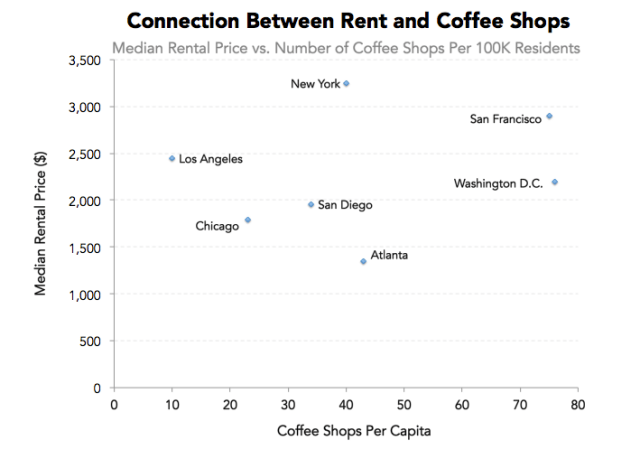
We also examined the number of coffee shops per capita in various cities across America. We found that generally, the number of coffee shops in a city did not correlate strongly with the median rental price, though there were some standout cities like San Francisco with a lot of coffee shops and high rent.
***
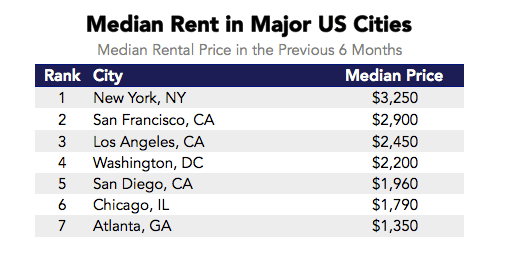
For our first look at the data, we want to determine median rental prices for our cities of interest. In our analysis, we will examine cities where there is sufficient data about both rentals and businesses.
Data source: RentHop
New York City has the highest median rent while Atlanta has the lowest. This follows what we would expect, with coastal cities with higher population densities being the most expensive.
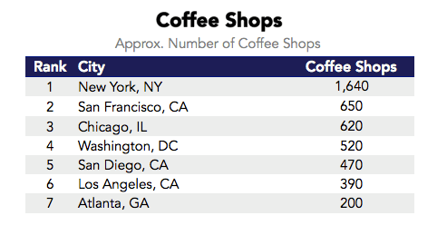
Within these cities, we also need to count the number of coffee shops and cafes. Restaurants or corner stores that also serve coffee were not included.
Data source: RentHop
Already we can see that our rankings are very similar to what we had for median rent. New York City is first with over 1,600 coffee shops. The next in our list is San Francisco with 650.
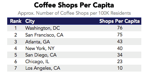
Cities that are larger in general will tend to have more of any kind of business. By adjusting for population, calculating number of coffee shops per 100K residents, we can control for this fact.
Data source: RentHop
Washington D.C. and San Francisco have the greatest number of coffee shops per capita. Los Angeles has the fewest. New York, which had the greatest absolute number of coffee shops, now sits at the middle of the pack.
Now we will take the two measures, coffee shops per capita and median rent, and plot them together to visualize the relationship.
Data source: RentHop
Overall, we do not see a clear trend supporting the relationship between coffee shops and rent. We are only looking at seven rental markets so additional research would be necessary to definitely prove the relationship between coffee and rent.
We do, however, have a rich set of data specifically for Manhattan in New York City. Manhattan is divided into 28 Neighborhood Tabulation Areas (NTAs) by the city government. We will group the business and rental data into these geographic areas and complete a similar analysis.
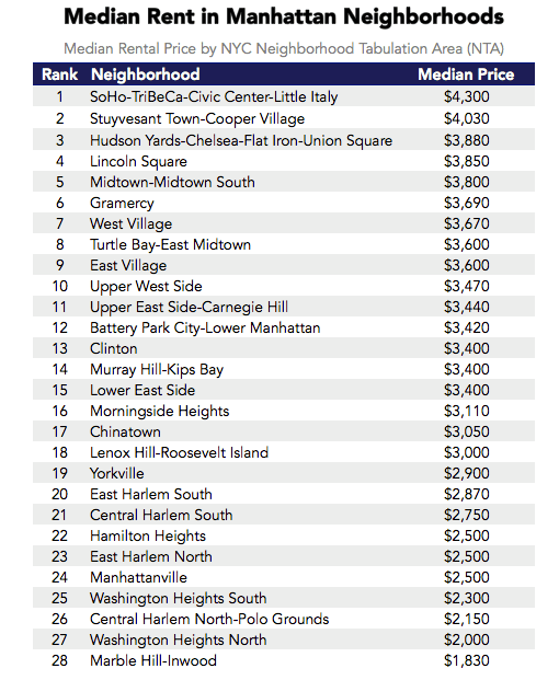
Now at a more granular level, will we see a clearer correlation between coffee shops and rent prices? Again, our first step is to list median rental prices.
Data source: RentHop
The area of SoHo–TriBeCa–Civic Center–Little Italy has the most expensive median rent. This area is one of the trendiest, with many expensive bars, restaurants, galleries, and boutique stores. Additionally due to history of development in Manhattan, the residential buildings are much smaller, increasing the pressure on price. Marble Hill–Inwood, at the very northern tip of Manhattan and across from the Bronx, is the least expensive. Inwood once had the highest crime rate in Manhattan, but recently has seen a large decrease in crime consistent with New York City overall. It also has a lower median income than most neighborhoods in
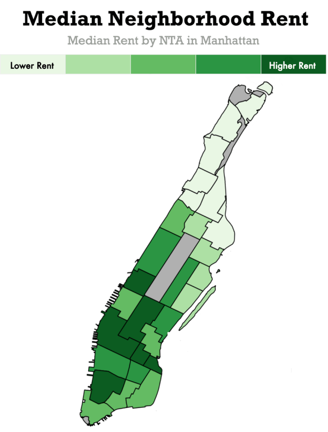
We have a map to help visualize the differences in rent. Neighborhoods were split into rent quintiles (five equal sized groups) based on prices.
Data source: RentHop. Grey areas do not have sufficient data for analysis
We can see that the areas of high rent are concentrated around the middle of the island especially near Central Park as well as the West Village area.
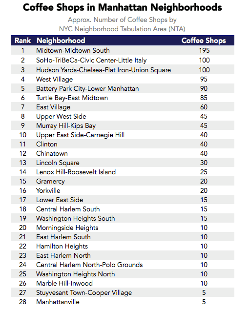
Next we will look at coffee shops in each NTA. How many coffee spots does each neighborhood have?
Data source: RentHop
Midtown-Midtown South has the greatest number of coffee shops. It has close to double the number of shops as SoHo-TriBeCa-Civic Center-Little Italy and Hudson Yards–Chelsea–Flatiron–Union Square. These areas with many coffee shops either the primary centers of business in the city or areas with lots of shopping and dining (for tourists). Several neighborhoods have 10 or fewer shops. There are a few possible reasons for their low ranking including being a smaller size or having a lower proportion of business in the area. Additionally many of these are neighborhoods with lower incomes generally, which seems like a plausible explanation but cannot be proven from this analysis.
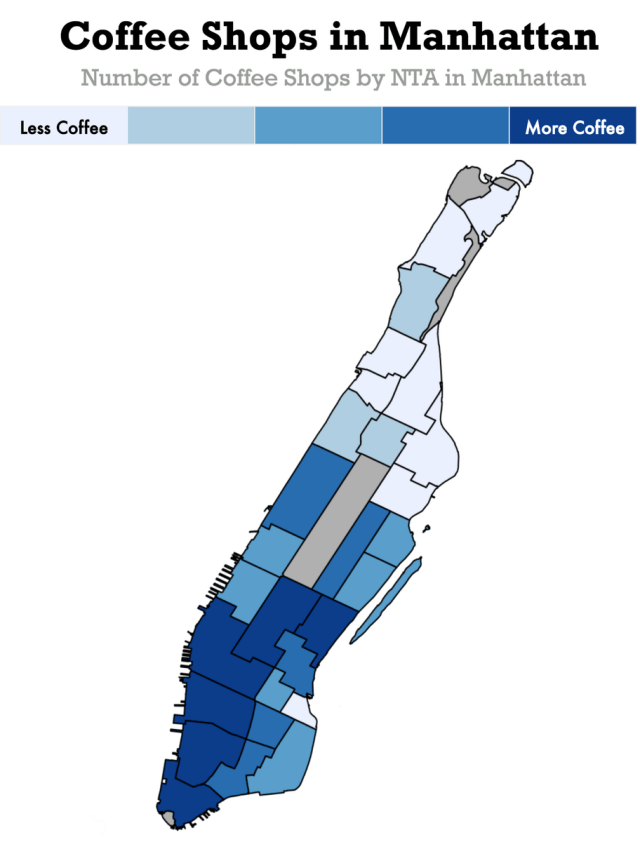
Again we will map this data to help visualize the differences. Similar to the last map, neighborhoods have been placed into quintiles based on the number of coffee shops.
Data source: RentHop. Grey areas do not have sufficient data for analysis
Again we see similar concentrations of the neighborhood groups. More coffee shops tend to be around Midtown and the lower-west end Manhattan.
It is clear from the maps of Manhattan though that each neighborhood is a different size. We can also confirm that they have different sized populations. To accurately compare each, we must account for the population in our calculation. We will do this by finding coffee shops per 100K residents, just as we did earlier.
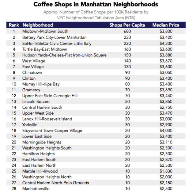
Data source: RentHop
Several of the same neighborhoods are at the top and bottom of our list. The top neighborhood again is Midtown-Midtown South. It has so many more coffee shops per capita than any other neighborhood due to it’s large commuter population and tourist population. Two of the other top four neighborhoods, Battery Park City-Lower Manhattan and Turtle Bay-East Midtown, are similar in nature and comprise areas around Grand Central Terminal and the Financial District.
With our map of Manhattan, we can see if a similar pattern appears in our neighborhood locations.
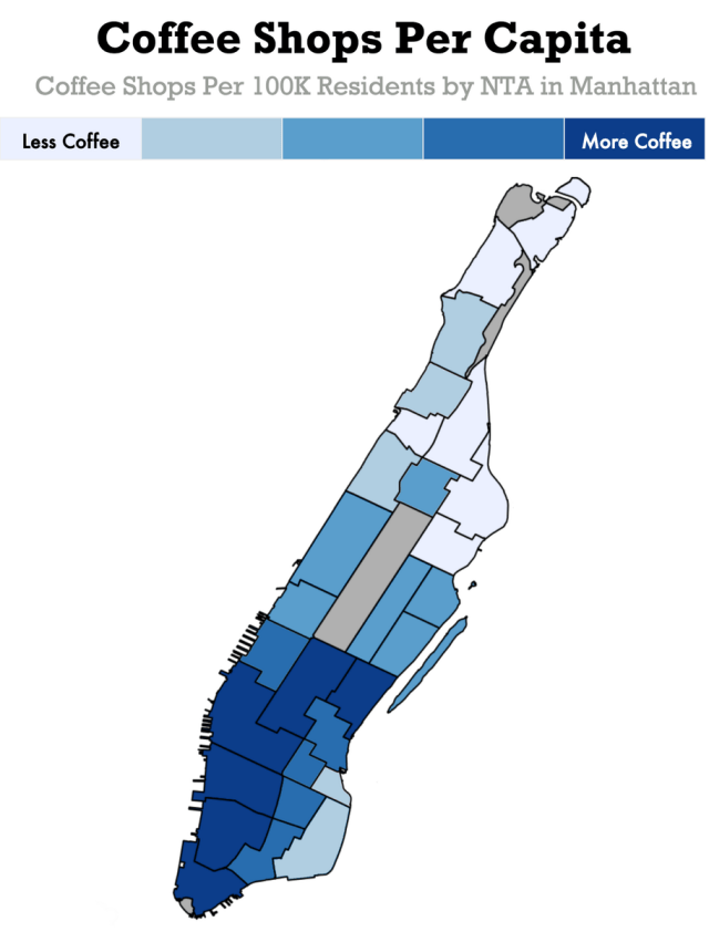
Data source: RentHop. Grey areas do not have sufficient data for analysis
In this map, there is more of a clear gradient from the northern tip of Manhattan (neighborhoods with the fewest coffee shops per capita) towards the bottom (neighborhoods with the most coffee shops per capita). This makes sense as we have explained earlier many of the neighborhoods below central park are full of offices and destinations for tourists. The other neighborhoods are more residential in nature, with relatively fewer businesses.
Finally, we will plot the relationship between coffee shops per capita and median rent to understand the relationship. We’ve labeled several neighborhoods to illustrate how different areas of Manhattan fall on the spectrum of coffee vs. rent.
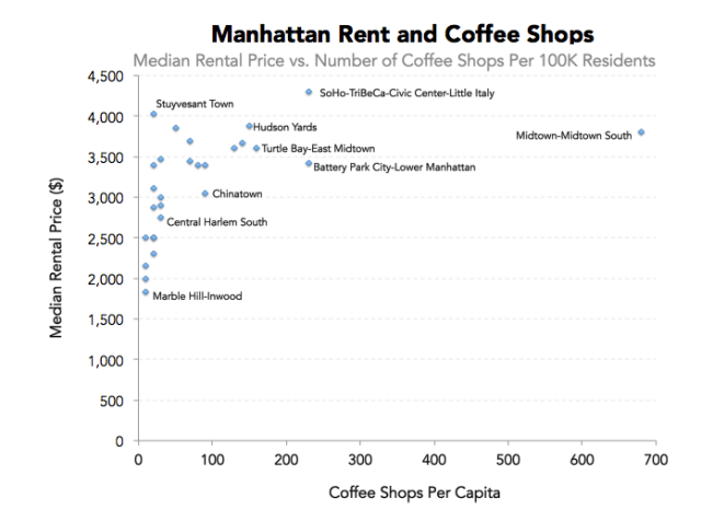
Data source: RentHop
This time the relationship, while still not linear, has a generally positive direction. A few notable outliers include Midtown-Midtown South and Stuyvesant Town-Cooper Village.
Midtown-Midtown South has more coffee shops per capita than any other neighborhood. As stated earlier, it is largely made up of office towers and tourist destinations. Most of the daytime population is made of up commuters coming into the city from outlying areas (especially NY state, NJ, and CT). This is also where Times Square and other areas where visitors to the city flock. It is most likely that these coffee shops are catering toward these crowds in addition to regular residents and therefore need more locations to keep up with demand.
A neighborhood with very few coffee shops despite being one of the most expensive is Stuyvesant Town-Cooper Village, a private housing development built after World War II originally for veterans and their families. The area is almost entirely residential, featuring 110 buildings surrounded by public parks. It has become a very desirable neighborhood due to the amenities and location, therefore quite expensive. As it was planned to be entirely residential, the neighborhood does not have the same mix of commercial and residential space as the rest of NYC. This artificially creates a shortage of coffee shops that we do not account for in our hypothesis.
***
It appears that the relationship is somewhat clearer for neighborhoods than cities overall. At the neighborhood level in Manhattan, there is a positive correlation between coffee shops and rental prices.
***
Note: If you’re a company that wants to work with Priceonomics to turn your data into great stories, learn more about the Priceonomics Data Studio.


