
Thirty years ago, as tech titans battled for real estate in the personal computer market, an inconspicuous young artist gave the Macintosh a smile.
Susan Kare “was the type of kid who always loved art.” As a child, she lost herself in drawings, paintings, and crafts; as a young woman, she dove into art history and dreamed of being a world-renowned fine artist.
But when a chance encounter in 1982 reconnected her with an old friend and Apple employee, Kare found herself working in a different medium, with a much smaller canvas — about 1,024 pixels. Equipped with few computer skills and lacking any prior experience with digital design, Kare proceeded to revolutionize pixel art.
For many, Susan Kare’s icons were a first taste of human-computer interaction: they were approachable, friendly, and simple, much like the designer herself. Today, we recognize the little images — system-failure bomb, paintbrush, mini-stopwatch, dogcow — as old, pixelated friends.
But Kare, who has subsequently done design work for Microsoft, Facebook, and Paypal, has also become her own icon, immortalized in the annals of pixel art. We had a chance to interview her; this is her story.
Graphic User Interface: A Brief History
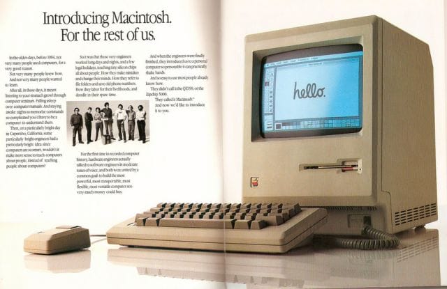
A 1984 Ad for the Apple Macintosh (Macintosh 128k); Source: Pinot Dita
It wouldn’t be fair to write about digital design without first paying homage to the development that made it possible: the graphic user interface (GUI). When Apple launched the Macintosh in 1984, they touted its simple, user-friendly GUI — but in order to create it, Apple pulled from a long lineage of innovation in the computing industry.
In the 1960s, Doug Engelbart, an engineer obsessed with human-computer interaction, pioneered the oN-Line System (NLS) at SRI international in Menlo Park, California. The computer incorporated a mouse-driven cursor and a multiple-window platform to work on hypertext.
By the early 1970s, Xerox PARC had utilized this technology to create the Alto personal computer, which was fully equipped with a bitmapped screen, and menus — and was the first computer to integrate a GUI. This was followed by the Star in 1981, which featured rudimentary icons. Xerox PARC essentially pioneered “pixel art:” Adele Goldberg and Robert Flegal, both of PARC, coined the term in 1982, and it existed as a concept as early as 1972, when the company developed SuperPaint.

Xerox 8010 Star Icons (1981)
While Xerox’s machines were expensive and commercially impractical, they greatly influenced the design of a number of personal computers through the late 1970s and early 1980s: Three Rivers PERQ, Apple’s Lisa (1983) and Macintosh (1984), and early Sun workstations.
Within 10 minutes of seeing Xerox’s GUI advancement, Steve Jobs proclaimed that “all computers would work like this someday.” In exchange for a pre-IPO purchase of Apple stock, Xerox allowed Jobs and his engineering team three days’ access to PARC to scope out the Alto and its development tools.
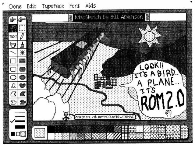
An early MacSketch (later MacPaint) design by Apple’s Bill Atkinson; Andy Hertzfeld
According to Bruce Horn, who worked at Xerox PARC for years before transitioning to the Macintosh design team in the early 1980s, what Jobs saw partially inspired his pet project, Lisa, but Apple made “substantial advancements:”
“Lisa featured some fundamental concepts: pull down menus, the imaging and windowing models based on QuickDraw, the clipboard, and cleanly internationalizable software.”
While the Lisa featured icons that were largely based on Xerox’s, Apple’s consumer-based computers didn’t feature today’s memorable icons until Kare joined the Macintosh team in 1982.
From Hog Sculptures to Pixel Art
Early Macintosh commercial featuring Susan Kare, circa 1983
In 1978, newly minted with a Ph.D. in design from NYU, Kare questioned her next move. Her thesis — “A study of the use of caricature in selected sculptures of Honore Daumier and Claes Oldenburg” — was indicative of her goal at the time: “to be either a fine artist or teacher.” She took a curatorial job at the Fine Arts Museums of San Francisco, and, by the early 80s, found herself in Palo Alto, “welding a life-sized razorback hog” for a museum in Hot Springs, Arkansas.
Under the lead of Jef Raskin, Apple had recently formulated plans to design the Macintosh, an “easy to use, low-cost computer for the average consumer.” When a call was put out for designers in 1982, systems programmer and design team member Andy Hertzfeld knew just the candidate.
Hertzfeld, who’d been moved from the Apple II team to the Macintosh team at Steve Jobs’ behest a year earlier, had been a high school classmate of Susan Kare’s; in fact, the two had known each other since they were 14. When he learned she was local, he gave her a call; Kare recalls:
“By remaining friendly with Andy after high school, I knew he obviously was really interested in computers. He showed me a very rudimentary Macintosh, and mentioned that he needed some graphics for it. He knew I was interested in art and graphics, and that if I got some graph paper I could make small images out of the squares, which he could then transfer onto the computer screen. That sounded to me like a great project. I did it in exchange for an Apple II, although I didn’t actually use the Apple II for Mac graphics.”
Kare’s old notebook sketches reveal the products of her labour:

Finger, later used for the “paste” command; courtesy of Susan Kare
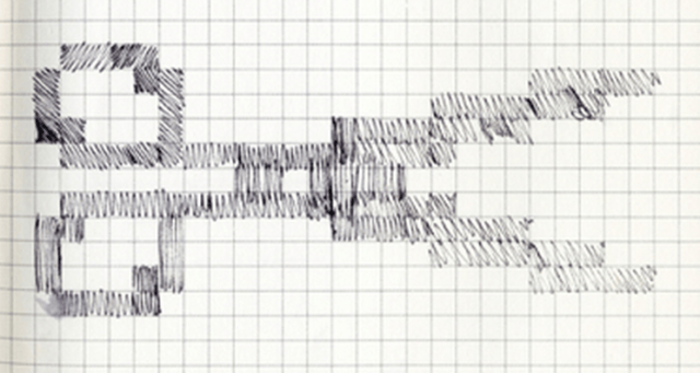
Scissors for the “cut” command; courtesy of Susan Kare
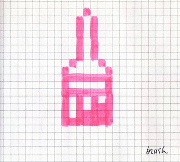
Paintbrush later used in Bill Atkinson’s MacPaint; courtesy of Susan Kare
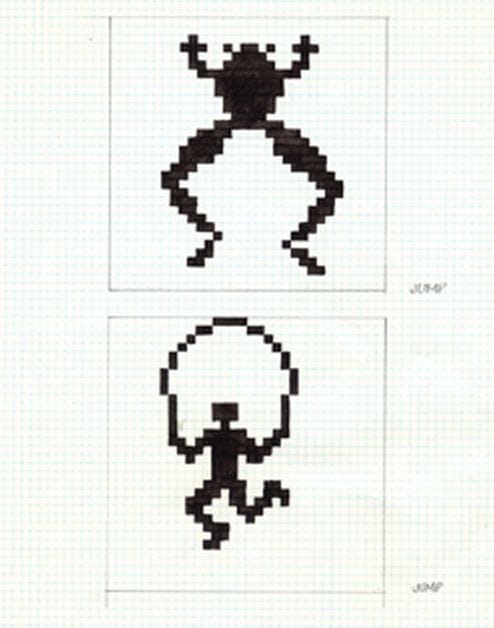
Two early designs for programming command “jump;” courtesy of Susan Kare

“Boot,” taken quite literally; courtesy of Susan Kare
Kare was subsequently offered a fixed-length, part-time job designing fonts and icons for the Apple Macintosh; her business card read “Macintosh Artist.” She’d never worked on computer graphics before Apple, but quickly made strides to adjust to her new medium. “I remember I didn’t really know anything about digital typography, but I got as many books on it as I could,” she recalls.
Kare found that pixels really weren’t that far removed from other forms of art — some of which dated back thousands of years:
“I still joke that there’s nothing new under the sun, and bitmap graphics are like mosaics and needlepoint and other pseudo-digital art forms, all of which I had practiced before going to Apple. I didn’t have any computer experience, but I had experience in graphic design.”
When she began, Macintosh had no icon editor — just a way to “turn pixels on and off.” But Hertzfeld soon sat down and worked out an icon editor that automatically generated the hex under the icons so that Kare could focus on the less technical aspects of her design work.
Usually, says Kare, the team would tell her what concepts they needed, and she would try to come up with a selection of things that might work; she’d try them out, and the final design would evolve from there. Her early icons drew inspiration from a wide range of sources — art history, wacky gadgets, and forgotten hieroglyphics.
Her concept for the “command” key mimicked the Saint Hannes cross, which was originally the symbol for a “place of interest” in 1950s Finland, became a traffic sign in Scandinavia, and, later, was used in Sweden to indicate an interesting feature or attraction in a campground. After Jobs had an outburst over the profligation of the apple symbol, Kare had leafed through a “comprehensive international symbol dictionary” to find this new alternative. To this day, it graces the keyboards of Apple’s computers.
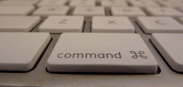
Command symbol pioneered by Kare, pictured on a modern Mac; Source: ajdv
There was an accessibility and a friendly quality to many of Kare’s early icons. the Macintosh was going after the average, technically-impaired American — the artist, the lawyer, the writer, the chef — and Kare’s designs were simplistic and easily reachable. (How could you say no to this little guy?):
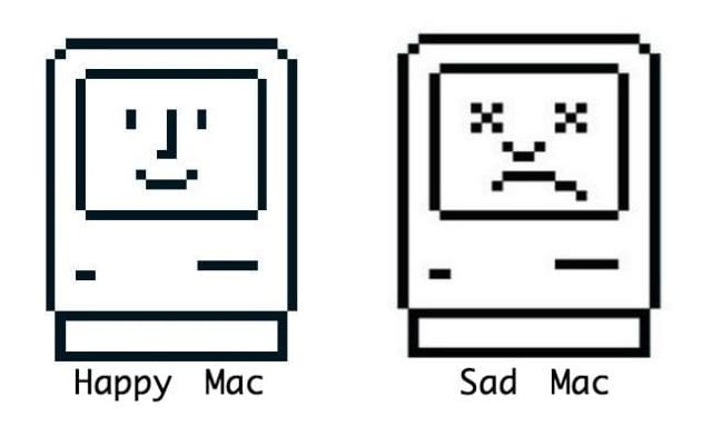
Mac icons for early Macintosh computers; courtesy of Susan Kare
The bomb, which denotes “total system failure” (and still sends chills down the spines of old-time programmers), was assigned to Kare with 32×32 pixel constraints:
![]()
Source: Andy Hertzfeld
Kare was also tasked with creating new font sets for the Macintosh. At the time, most digital typefaces were monospaced (ie. narrow and broad characters were mashed together in the same bitmapped space); Kare had to implement the first screen-based proportionally-spaced font. She describes her process:
“I started with Chicago (the bold system font, originally called Elefont) and went on to design a number of others including New York , Geneva, Monaco, Cairo, San Francisco, and Toronto. Since the Macintosh originally was paired with an Imagewriter dot matrix printer, I created families of bitmap fonts that scaled down to appear smooth when printed.”
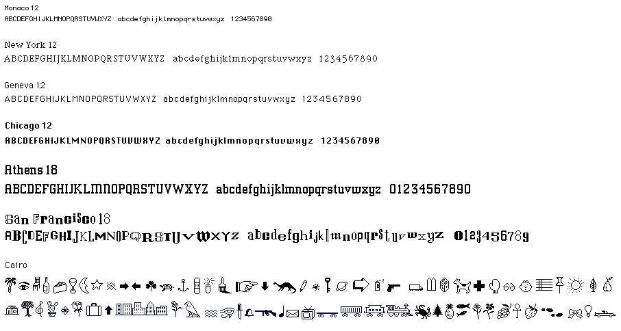
Selection of Kare’s fonts; courtesy of Susan Kare.
Years later, in his now-famous Stanford commencement speech, Jobs said “the Mac would have never had multiple typefaces or proportionally spaced font” if not for a lone calligraphy class he’d taken at Reed. Though Kare had never heard him mention this during her design process, she says Jobs was extremely particular in the way he wanted fonts presented:
“I learned to never just show Steve something and ask, ‘Do you like this?’ because he’d invariably say no. He wanted you to work on it more and come up with something better. The workaround was to come up with several options and ask him which one he liked.”
One of these options happened to be Cairo, which Kare designed as “a set of fun modern hieroglyphics.” The font set — composed of images ranging from a palm tree to a handgun — was meant to provide an easy way for users to easily combine images with text.

Moofcow, the…dog? Courtesy of Susan Kare
Perhaps the most famous of the Cairo characters was Clarus the Dogcow, a funny-looking canine initially mistaken for a cow. Clarus was selected for use in the Apple preferences to choose portrait or landscape mode, and developed a cult following. (Today, Kare sells prints of her old Mac art; she says this is the best-selling one).
“One character was a spotted dog, but some people thought it looked a bit bovine. A slightly distorted version of the dog was used in Apple preferences to choose portrait or landscape mode. It’s definitely one of our bestselling Kare Prints.”
Aside from all of her incredible contributions to the Macintosh’s GUI, Kare was also a team player who, according to Andy Hertzfeld, “had a whimsical sense of humor” in the office. Hertzfeld recalls an instance in which Kare’s spirit emanated through her work:
“One day, I came over to her cubicle to see what she was working on, and I was surprised to see her laboring over a tiny icon portrait of Steve Jobs. Icons were only 32×32 black or white pixels — 1024 dots in total — and I didn’t think it was possible to do a very good portrait in that tiny a space, but somehow Susan had succeeded in crafting an instantly recognizable likeness with a mischievous grin that captured a lot of Steve’s personality. Everyone she showed it to liked it, even Steve himself
It became a Mac team status symbol to be iconified by Susan. She did a few more portraits, for various members of the team who desired to be immortalized in a thousand dots. She’d usually work on them in the late afternoon, chatting with the subjects as they posed, while other team members listened in. I got to know a few of my teammates a lot better from these sessions.”

Jobs’ recognizable visage; Andy Hertzfeld
On his Apple folklore website, Hertzfeld also recalls one of Kare’s earliest shows of flair.
In 1983, Steve Jobs stood before the Macintosh team at a company retreat in Carmel and gave them a piece of his mind. “It’s better to be a pirate than to join to Navy,” he said, scanning the group of rebellious skunkworks.
Later that year, the growing team of 80 would move office spaces to the bigger (and less imaginatively designed) “Brandley 3.” Sensing that the space didn’t reflect Mac’s culture, Kare took it upon herself to revitalize the company’s whimsical spirit: the young designer sewed a flag with team member Steve Capps, festooned it with an enormous skull-and-crossbones (requisite with a rainbow-colored Apple logo for an eye patch), and mounted it on the company’s roof-turned-poop deck.
The flag became a permanent fixture on the building, and a reigning symbol of the team’s resilience.
Years later, Kare would be promoted as one of several Creative Directors of Apple’s Creative Services. When Jobs was forced out of Apple in the mid-80s, he started NeXT and took several former members of the Macintosh team with him. Among them was Susan Kare.
Life After Apple

Virtual gifts, courtesy of Susan Kare
Kare was one of six initial Apple employees to leave for Jobs’ new computing venture in 1985. She began as a designer, working with Microsoft to design various icons for Windows 3.0, as well as the system’s solitaire game. Many of Kare’s icons — principally those for Notepad and the Control Panel — remained largely unchanged until the introduction of Windows XP in 2001.
In 1986, Kare had the opportunity to hire one of her “design heroes,” Paul Rand, to design the logo and develop NeXT’s brand identity, at a cost of $100,000:
“I’d always admired his work, so that was a fantastic opportunity for me — to be able to meet and work with someone who had been a hero to me, and introduce him to Steve. And I think Steve and I both learned a lot from him. He was very unequivocal, a great person with a tremendous amount of self-confidence: I remember him almost pounding the table, saying ‘I’ve been doing this for fifty-five years, and I know what you should do!’ It must be great to have that much confidence in such an inexact science.”

Windows 3.0 Solitaire, via Susan Kare
Working closely with Jobs was a rewarding whirlwind, recalls Kare, but also trying — especially when trying to reach last-minute deadlines:
“I worked with Steve on many film slide presentations for NeXT in the pre-keynote days, when a complex build was expensive and time-consuming. He would not hesitate to make minor changes at the last minute if a small copy or color tweak would make the show better, even if it meant redoing dozens of slides the night before!”
When NeXT was sold back to Apple in 1996, Kare embarked on an independent career, following a dream of opening her own design firm; the decision led to successful collaborations with SF Water and Power, Glam.com, Paypal, Facebook, and a number of startups.
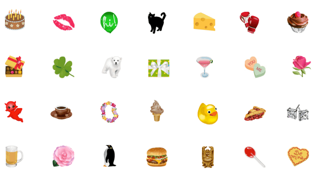
Facebook gifts, circa 2010; courtesy of Susan Kare
In late 2006, she was recruited by Jared Morgenstern (one of Facebook’s early designers) to create a suite of 64×64 pixel Facebook virtual gifts; between 2007 and 2010, Kare modeled hundreds of them. The gifts were immensely popular and millions were sold, but the shop closed in August, 2010, when Facebook transitioned to third-party apps.
Today, Kare heads her digital design practice in San Francisco, where she is the principal (and sole) designer, and sells signed prints ranging from $99.99 to $499.99. Her work has been featured in the Museum of Modern Art store in New York City.
She’s currently designing several logos and icon sets, but has a few special projects “in the pipeline,” including “woven Mexican blankets or rugs or mosaics, that feature ‘bitmap’ imagery.”
A Unique Approach to Art
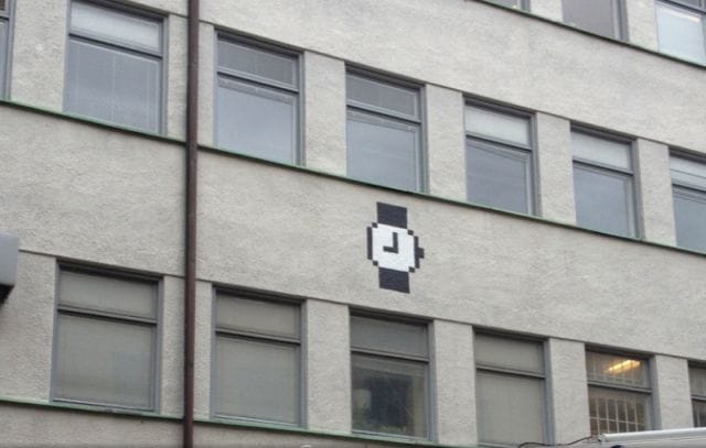
Watch cursor in Göteborg, Sweden, 2013; Courtesy of Susan Kare
|
Kare attributes much of her success to an unwavering dedication to a core set of ideals: simplicity, clarity, and beauty:
|
This post was written by Zachary Crockett, on a Macbook. Follow him on Twitter here, or Google Plus here.


