This post is adapted from Experiment Engine, a Priceonomics Data Studio customer. Does your company have interesting data? Become a Priceonomics customer.
***
When William Sealy Gosset invented the A/B test more than a hundred years ago, he had no idea that he had created the perfect test for Internet businesses.
The A/B Test dates back at least to 1908, when William Sealy Gosset, writing as “Student”, developed his t-test to identify the best barley for brewing beer at Guinness. His methodology allowed for a statistically rigorous comparison of two groups to determine whether there was a significant difference between them. While this surely helped to keep the quality high at Guinness, it also created a powerful tool for everyone from audio engineers to direct mail marketers to determine what works and what doesn’t.
But A/B testing has really taken off over the last couple decades. Companies have recognized that the Internet is tailor made for A/B testing: changes to apps and websites are quick and cheap, and the impact can easily be quantified in clicks and sign-ups.
Some businesses find that minor design changes, like changing a website’s background color or the size of a button, can influence customer behavior dramatically. Google famously tested 41 different shades of blue for their toolbar. While this may seem like overkill, small differences in click-through rates can mean big dollars for a high traffic website.
Priceonomics customer Experiment Engine, a platform for helping people manage their A/B testing programs, has accumulated a wealth of data on how people use this statistical test. To understand what kinds of tests companies are conducting, and which ones show real impact, we examined Experiment Engine’s dataset consisting of A/B tests conducted in late 2014 and the first half of 2015.
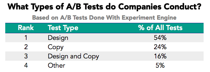
We found that the most common A/B tests are design changes (such as changing a color or the placement of a button) and copy changes (such as testing different text above a button). While design changes are the most common, we also discovered that they are, on average, less impactful than changes to the site’s headlines and written content.
When we examined design changes, we found that tweaks to the placement and arrangement of key elements, especially those that simplified and streamlined the site, tend to show the greatest impact.
There are two main types of A/B tests that our customers conduct: design changes and copy changes. Copy changes test the content or phrasing of text on the site, whether titles, headlines, paragraphs, or even the “Click Here to Learn More” language on a button.
Design changes include changes to the color scheme and layout of the page, adding or removing elements like images and buttons, and changes to the functionality of the page.
The table below shows which types of changes are most common.
Data source: Experiment Engine
A majority of tests involve design changes, though a significant minority included at least some changes to the website’s copy. The “Other” category is primarily made up of policy changes like free shipping offers and changes to return policies.
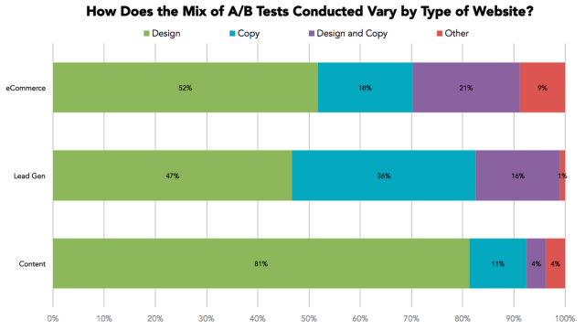
We work with a variety of websites, but the majority of them are eCommerce, lead generation or content companies. We were curious about how the mix of tests differed between these types of websites.
Data source: Experiment Engine
Design changes predominate across all types of websites, but they are especially favored by Content sites. Perhaps these media-focused sites have confidence in the specific content they wish to display—and are focused on finding the most compelling ways to display it.
Lead generation websites, which sell customer contact information to other businesses looking for sales leads, are unusually likely to focus on testing copy changes. It may be that getting a user to enter their contact information requires a clearly articulated value proposition more than effective design.
***
So do A/B tests actually work? We found that 21.5% of all the A/B tests (for which we have data) showed some statistically significant impact. While this may seem low, most companies that work with us test multiple factors at once, so having roughly one in five show an impact is actually quite good.
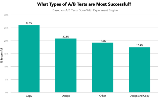
Which types of tests most often garner significant results? The chart below shows success rates for each type of A/B test.
Data source: Experiment Engine
With a 26% success rate, changes to the website copy tend to be the most successful. Perhaps Lead Generation websites are on to something. It also appears that making changes to both design and copy in a single test may be a bad idea.
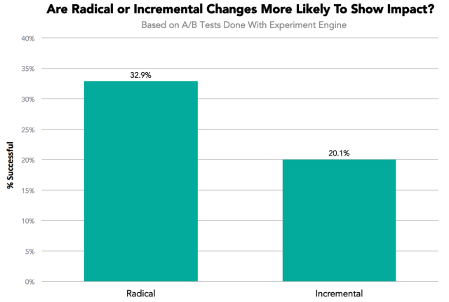
We also wanted to explore whether incremental changes (like Google’s test of 41 shades of blue) or more radical overhauls tend to yield more successful tests.
Data source: Experiment Engine
Clearly, radical changes tend to be more successful. This may be because they are more likely to have a clear hypothesis behind them, while incremental changes are more speculative.
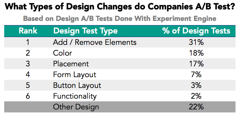
Finally, since a large proportion of our customers’ A/B tests were design changes, we dug into the exact types of design changes companies are making. The table below shows the most popular categories of design changes.
Data source: Experiment Engine
By far the most common design change is the addition or removal of website elements like images, banners, and tabs. Color changes are next at 18% of all design changes, and changes to the placement of elements is also fairly common. Changes to forms, buttons, and website functionality are rare.
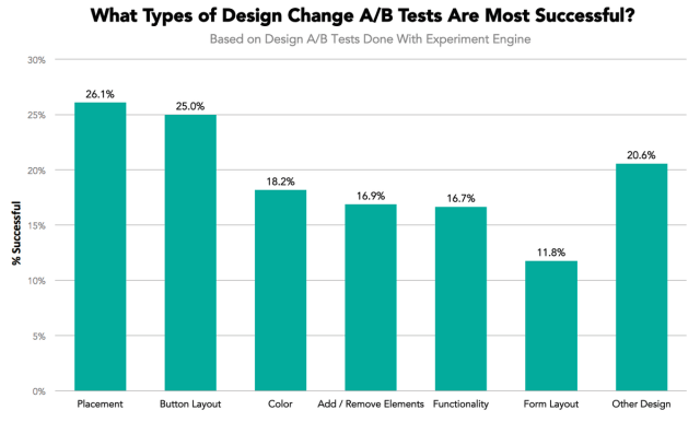
We also examined which of these specific design changes are most effective.
Data source: Experiment Engine
Placement and button layout stand out as the most impactful design changes. Both of these changes likely help visitors navigate sites more effectively, so it’s not surprising that they yield the greatest results.
Changes to color, elements, and functionality are less impactful, with success rates hovering around 17%. Changes to the layout of forms—where visitors enter their contact information—were the least successful. It may be that people are not dissuaded by minor design issues once they decide to fill out a form.
***
Overall, the data suggests that A/B testing is most effective in testing fairly radical changes to websites’ copy and overall layout. Design changes focused on optimizing the placement of elements and streamlining the user experience may yield better results than tweaking color patterns.
As a web user, this is good news. Companies see the best results when they improve your experience on their site and write clear and compelling copy. You probably care a lot more about a site being easy to use than whether the website uses the perfect shade of blue.
![]()
Note: If you’re a company that wants to work with Priceonomics to turn your data into great stories, learn more about the Priceonomics Data Studio.


