


When Nikki Sylianteng got a $95 parking ticket last winter, she realized that she was dealing with much more than a fine: she was dealing with a design problem.
“It was my fault,” she admits. She says she had been “so happy to find a parking spot,” she didn’t read the sign carefully enough. But, Sylianteng also felt like she shouldn’t have had to read the sign so carefully.
She suspected there were many parking offenders like her out there, who wanted to obey the law but had trouble discerning what that law was. Cities could make it easier for them, and improve parking compliance, just by making the parking signs clearer. As far as she could see, she was surrounded by a pretty confusing system of signage.
So, she decided to fix it.
She didn’t do this by fighting the ticket, nor by running for city council. Instead, Sylianteng committed act of guerilla civic design, which shocked the gears of municipal bureaucracy into motion. Someday, when better signage comes to a curb near you, you’ll have to thank Nikki.
Too Many Tickets
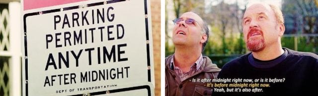
Louis C.K. on parking in Los Angeles
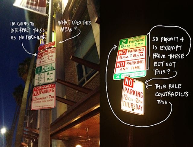
Nikki Sylianteng got that ticket in the traffic-choked city of Los Angeles, where she was born, and where she spent a good chunk of her adult life incurring parking tickets.
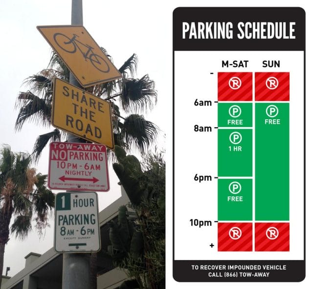
Parking is a particularly difficult problem in LA, where it’s fairly common to see totem poles of individual parking signs with different rules piled ontop of one another, competing for primacy. Even enforcers get the rules wrong, sometimes, leading to embarrasment and refunds.
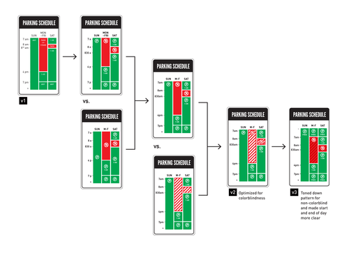
Sylianteng first tried to redesign parking signs when she was living in LA and applying to grad school, in a project she called “To Park or Not to Park.” She reduced the usual jumble of signs and regulations to a single, holistic panel, which looked a lot like a Google Calendar – it was a grid of days of the week, broken into hours. The blocks of time when a parking spot was valid she shaded green, the blocks of time it was invalid she shaded red. She also simplified the rules she illustrated, working off the principle that people would much rather adhere to an overly restrictive regulation than get a parking ticket.
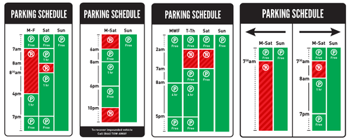
Some To Park or Not to Park examples
She was especially happy with the project because non-designers seemed to ‘get it.’ “It was one of my only projects that I could point to,” Sylianteng says, “and my friends who weren’t designers would say, ‘Oh, now I understand what you do.’”
But, at the time the project was mostly a portfolio piece. She didn’t have ambitions for To Park or Not To Park beyond showing her design chops off for schools. She let it go dormant once she was accepted to the School of Visual Arts in Manhattan. She moved to New York and, for a while, rode the subway and didn’t think about parking.
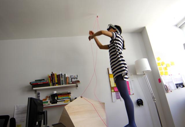
Nikki, working on a design school project
When she got this last ticket, she was out of grad school, freelancing. She was only vacationing in LA, visiting family, but the ticket reminded her what a headache parking could be. She paid her fine, (“I always pay them,” Sylianteng says,) and decided the time had come for her to do something with her parking sign redesigns.
Hypothetically, she could have gone straight to city officials with her sketches, but the thought barely crossed her mind. From her perspective, while the designs seemed like an obvious improvement on the status quo, they weren’t anywhere near finished. For one thing, they hadn’t undergone the feedback process which Sylianteng had come to think of as crucial to good design.
“They were just in my portfolio all these years,” Sylianteng said. “I didn’t know whether people understood them, they were just pictures I’d put together in my head that made sense to me.”
Instead of writing up a proposal to take to a city council meeting, Sylianteng did what she had learned to do in design school: she made a prototype and started user testing.
Guerilla Public Service
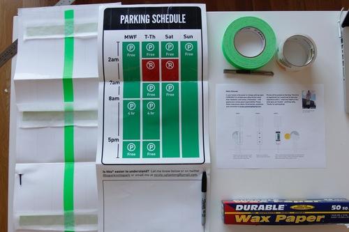
The prototype kit
First, Sylianteng picked a few parking signs in her neighborhood in New York that she thought were particularly confusing. She remade them using her own, graphical template, printed these out on paper, laminated them with packing tape, and then taped them up on the poles beneath the originals. Her prototypes also included a marker and a blank section for people walking by, or who had just parked, to leave their thoughts, comments, and suggestions.
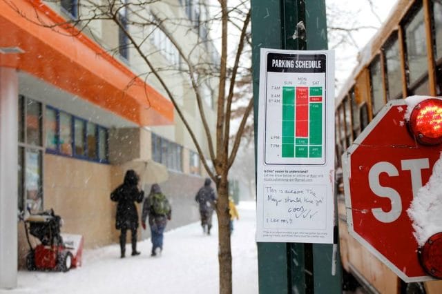
She also included social media handles for the project, and the url for the To Park or Not To Park website. On it, people could learn more about the project, view her sketches, and provide more feedback. They could also find the materials to build signs of their own, or they could send Sylianteng a photo of a sign they wanted fixed. She would redesign it for them, print it out, and mail them a kit to post it. More signs popped up in New York and LA. “The mayor should hire you,” a New Yorker wrote on one of the redesigns.
Her prototypes provoked a lot of commentary, discussion, and praise. She used this feedback to improve her designs. She printed out new prototypes, and taped those up. The feedback validated some of her central assumptions, among them: (1) a lot of current parking signs were very confusing, and (2) people didn’t care why they could or couldn’t park somewhere, they just didn’t want to be ticketed.
“I’ve found people would rather be told they can’t park somewhere, than be told, ‘Here are the rules, figure it out yourself!’ and given a ticket,” she says.
A redesign of a Los Angeles parking sign
She gives the example of signs that forbid parking on ‘school days.’ “In the summer, people drive up to these signs and say to themselves, ‘Of course there isn’t school today, school’s out!’” Sylianteng says. “But what they don’t know is there’s summer school.”
Sylianteng’s signs leave a lot of that kind of minutae out. “My signs are not one-to-one translations of existing signs, they’re over-restrictive simplifications,” she explains. In a zone that prohibits parking on ‘school days’, her sign would show that parking was prohibited on all weekdays.
Sylianteng says she didn’t even stop to consider the legality of what she was doing before putting up her own, non-regulation parking signs. She says she thought of them as flyers – like someone would post for a concert or a lost dog.
While many cities have laws against vandalism and unauthorized signage, it wasn’t clear that Sylianteng was in violation of either. Unlike the vigilante parking signs beachside residents sometimes erect to protect their curbs from beachgoers, or the ones valets put up to illegally reserve street parking spots, Sylianteng’s signs did not deliberately mislead drivers about the law for her personal benefit.
Her signs were more of a “guerrilla public service” – which is how artist Richard Ankrom described his 2001 street signage project. He donned a homemade Caltrans uniform and modified a highway sign to make a particularly difficult junction less confusing. Nobody noticed an unauthorized change had occurred until he pointed it out to the media nine months later. The sign remained another eight years, until Caltrans removed it and replaced it with a new sign, officially bearing his edits.
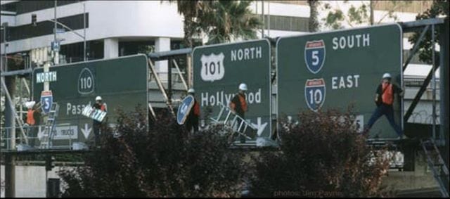
Collage of photos taken by Jim Payne of Ankrom installing his art piece
But unlike Ankrom’s sign, Sylianteng’s were transparently unofficial. They even bore the footnote, “This is an experiment by a girl who has gotten too many parking tickets, and thinks there must be a better way.”
In any case, Sylianteng welcomed media attention to the project. The Atlantic caught on in a matter of weeks, and interviewed her. In the months that followed, the project was covered by a wide variety of outlets – from FOX News to Popular Mechanics. Frustration with parking signs, it seemed, was ubiquitous enough that Sylianteng’s vigilante effort was national news. FOX called it “tactical urbanism.” LAist was bolder, gratefully proclaiming in a headline: “This Woman is Doing God’s Work.”
Quicker Than She Anticipated
One of Nikki’s redesigns in New York
In October 2014, she got an email from Los Angeles city council person Paul Krekorkian. He wasn’t writing to ask her to stop producing LA signs. On the contrary: he wanted her permission to propose her design at the next council meeting.
Krekorkian had read about her designs in the news. The council voted to pilot the signs for official adoption, and the Department of Transportation launched a study.
By now, similar discussions have occurred in city councils in other states, and in other countries. The bureaucratic process of changing official signage seems to be slow just about everywhere, but politicians are surprisingly enthusiastic about the ‘rogue’ design project. A councilperson in Australia said of To Park or Not To Park, in almost comically lofty rhetoric, “It’s much more elegant and it enhances visual amenity, it enhances driver understanding and it’s altogether more pleasant and a simpler design than the melange that we often have at present.”
“I thought getting the attention of cities was going to be an uphill battle,” Sylianteng says, “but they were actually interested much quicker than I anticipated.”
While Sylianteng feels that she’s now honed her designs into a finished product, she has a lot of work to do on the project’s website in order to accommodate politicians interested in purchasing her designs. Currently, users who download the design template have the option of donating however much they wish, and Sylianteng has debated making the payment structure more rigorous.
The road to a better, better parking sign
“It’s tough call for me, because even the templates are more of a process than a finished design,” Sylianteng says. “The idea is that, in the development of any city’s redesign, people can submit feedback and the city can adopt the result.” Ideally, she says, that will involve simplifying the law, adding, “A lot of these signs are confusing because the laws behind them are confusing.” In the meantime, she’s received other funding for the project in the from foundations that think her work is “awesome.”
When she’s not working on To Park or Not To Park, she and her masters advisor are putting together a bootcamp to coach creative people through launching their side projects. “[The course] focuses on an early milestone:” Orbital Boot Camp’s website reads, “getting your idea out of your head and into the world.”
On this, Sylianteng has proven to be somewhat of an expert. As FastCompany observed, the recent political fervor for her parking project means, “Sylianteng may have her designs enshrined into government policy without actually dealing with the labyrinth of bureaucracy herself.” For any talented maker who has wanted to make a difference, but been scared away from civics by politics, this would be an inspiring victory indeed.
This post was written by Rosie Cima; you can follow her on Twitter here. To get occasional notifications when we write blog posts, please sign up for our email list