


This post is adapted from the blog of Udemy, a Priceonomics customer.
Data visualization is increasingly at the center of how we digest information. The last several decades have seen an explosion in the use of charts, and a recognition of the incredible ability of the human mind to process data visually. The rise of visualization has coincided, probably not coincidentally, with a formalization and deeper consideration of just what works best when attempting to convey information in graphical form.
Perhaps no person is more responsible for giving data visualization a scientific foundation than the statistician William Cleveland. His studies on graphical perception, the cognitive processes people use to understand a chart, are among the earliest attempts to study visualization and develop a theory of how it should be best done.
The cleaner, minimalist charts in vogue today owe a great debt to Cleveland’s work. His research is also the ultimate reason most data visualizers have a fondness for bar charts and scatter plots, and tend to avoid pie charts and stacked bars.
***

Data visualization pioneer William Cleveland
As a statistician working in the early 1980s, William Cleveland was deeply concerned about the “largely unscientific” manner in which statisticians and others were visualizing data. Although charts had been used to represent data since the 18th Century, there was very little theory or research about how it should be done. In Cleveland’s view, most of the contemporary ideas about “proper” visualization were mostly unstructured wisdom.He believed the conventions and best-practices of data visualization — a tool widely used by scientists and engineers — should be backed up by data.
He was not alone. Noted statisticians David Cox and William Kruskal, had also called for theoretical and empirical foundations on how to best use graphs. Cleveland would answer this call.
In 1984, Cleveland and his colleague Robert McGill published the seminal paper Graphical Perception: Theory, Experimentation, and Application to the Development of Graphical Methods. This paper, which has now been cited thousands of times by academics, remains a touchstone for data visualization researchers and practitioners.
In Graphical Perception, Cleveland and McGill detailed the common cognitive tasks that happen when somebody reads a chart, then they evaluated how well study subjects performed these tasks, depending on features of the graph.
For example, when people look at a bar chart, they claim that the main task is judging “position on a common scale” — assessing which bar goes higher on the scale, how much higher, etc. When people look at a map in which states are saturated by a certain variable, the main task is assessing “color saturation” — assessing which shape is more saturated, how much more saturated. The following figure from their paper displays what they believed to be the common “Elementary perceptual tasks” that people are asked to complete when looking at charts. “Color saturation,” at the bottom, is not illustrated to avoid the “nuisance” of color reproduction.

Common “perceptual tasks” for comprehending a data visualization; Cleveland and Mcgill
After laying out this “task” paradigm for thinking about charts, the remainder of Graphical Perception is focused on understanding how skilled people are at each of these tasks. The authors ran a number of randomized control trials to assess how accurately people perceive the information on a bar chart (position on common scale), pie chart (angle), stacked bar chart (area), colored maps and shaded maps (color saturation and shading), and others.
Perhaps most famously, they had students look at a variety of two-valued bar charts and pie charts, and asked them to assess the percentage the lesser value was of the greater value. Subjects consistently read the bar charts more accurately than the pie charts. This research would mark the the beginning of the end for pie charts — an already rarely used form — in serious quantitative research.
The authors provide a general hierarchy for the types of data we most accurately understand:
- Position along a common scale (bar chart, dot plots)
- Positions along nonaligned, identical scales (small multiples)
- Length, direction, angle (pie chart)
- Area (treemap)
- Volume, curvature (3-D bar charts, area charts)
- Shading, color saturation (heat maps, choropleth maps)
Although research that followed Cleveland and McGill’s would refine this ordering, overall, this hierarchy has proven to be quite accurate.
“The Elements of Graphing Data” is William Cleveland’s seminal work on scientifically sound data visualization.
Published a little over a year after Graphical Perception, Cleveland’s book-length treatise The Elements of Graphing Data fully detailed his theory and beliefs about proper visualization. Modeled after Strunk and White’s classic writing style guide, The Elements of Style, Cleveland’s book aimed to put good visualization practice on the same level of importance for researchers as correct grammar.
Unlike the work of the more famous and aesthetically focused visualization champion Edward Tufte, Cleveland’s work is specifically directed at scientific researchers, who are presenting data to others in the scientific community. The recommendations in the book are based on the assumption that the reader of a graph is already interested in the material, and that frills are unnecessary to draw them in. This is in contrast to infovis graphics, which are often oriented to attracting the reader’s attention.
Many of the suggestions in The Elements of Statistical Graphing are basic but fundamental. Cleveland stresses stripping charts of unnecessary and distracting elements of a graph that don’t allow the data to stand out (Tufte refers to these superfluous elements as chartjunk). Cleveland also emphasizes that legends should be kept out of the data region, tick marks should be kept to a minimum, and data labels shouldn’t clutter the graph. These tips are like the writing advice of Strunk and White, which focus on “omitting needless” words and using the active voice.
Cleveland also furthered his discussion of how people perceive charts, and which visual representations are best for which data. He recommends that data points be put as close together as possible, because people more accurately compare elements that are closer together.
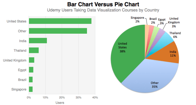
Cleveland continued his assault on the pie chart, “Pie charts do not provide efficient detection of geometric objects that convey information about differences of values.” Those are strong words for the usually tempered Cleveland. The following shows two visualizations of the country location of Udemy Users. According to Cleveland’s research, most people will more quickly and accurately comprehend the information if they look at the bar chart.
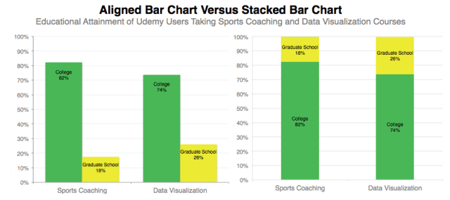
The stacked bar chart also receives Cleveland disdain, he demonstrates that people understand aligned bar charts substantially better than stacked ones. His research suggests that people’s error in estimating the relative sizes of a category within a stacked bar chart are significantly worse than when they are aligned.
Below are two different charts that show the education level of users who take Udemy’s data visualization courses versus the users who take sports coaching classes. The chart on the left shows Cleveland’s preferred method.
***
The impact of Cleveland’s work is most expressed through the many data visualization leaders he has affected. Noted statisticians and data visualization experts Stephen Few, Nathan Yau and Hadley Wickham have all discussed being influenced by the ideas of Cleveland. Each of them has written books that espouse ideas Cleveland developed.
Many data visualization experts see Cleveland as creating the basic rules for chart makers to follow. But, as the saying goes, rules were made to be broken, or at least bent. Yau, of Flowing Data, notes that Cleveland never claimed that his ideas were “precise prescriptions for displaying data,” but rather a “framework.” Yau believes there is a time and place for pie charts and color saturation.
As data visualization has grown more creative and interactive, it remains grounded by the scientific foundation provided by William Cleveland.