


A couple months back, we unveiled our new data visualization product, Onomics.
The premise of Onomics is simple. Paste in your data, make beautiful D3 charts that you can easily brand with your logo and embed on the web. Onomics initially started with one genre of charts — the data table — because that’s our favorite kind of chart at Priceonomics and there wasn’t a good solution out there.
Onomics is a tool we use to create the charts on Priceonomics. It’s free and you can use it too.
Today, we’re adding more chart types to Onomics — vertical bar charts, horizontal bar charts, and line charts. Our goal with Onomics is to create a tool that guides you to quickly make clear data visualizations that are easy to share. We can now use our tool to make most of the charts you see on this site and you can too.
***
When we launched Onomics, we wanted to make it really easy to create a table table with your logo on it. Just paste your data in and toggle between different flavors of tables. Sorting, number of rows and columns displayed, table-type, logo-addition can all be iterated quickly using the interface.
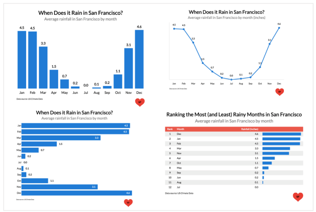
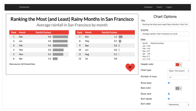
Here’s an example of the interface and a table. Let’s create a chart that shows the average amount of rainfall per month in San Francisco. Let’s also add a cute made-up heart logo:
Which then outputs a table that you can embed on a webpage or download as an image. The below chart is an embeddable table that’s crawlable by Google:
It made our life so much easier in the Priceonomics Data Studio, where we help companies turn data into stories, because it made making tables really easy.
In the above chart, we tried about 5 other permutations of this in a few minutes before settling how using two columns, sorting the data in descending order, and having a “rank” column. In excel, it would taken at least ten times longer and adding these “data bars” to the table would have been nearly impossible, as would embedding the chart on the web.
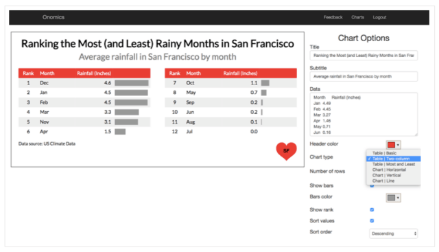
Now, we’ve added other types of charts that we frequently use at Priceonomics to Onomics — vertical bar charts, horizontal bar charts, and line charts. With a quick drop down, you can show the data however you like.
Let’s create vertical bar chart and turn off sorting by rainfall so that it’s in chronological order. Two clicks later we have:
Dang, it doesn’t rain much in the summer! (A note to tourists, it can be quite foggy and chilly in the summer, however).
What about a horizontal bar chart instead? Glad you asked:
The chart is automatically sized to fill the space and data labels are automatically colored white or black based on whether they site on the bar or adjacent to one (which is determined automatically).
Lastly, you can show the data as a line chart now in Onomics, which is especially helpful for time series data, such as how much rain happens per month in San Francisco.
This is the “beta” version of our new charts functionality, which which you can try out here without even creating an account.
As a next step, we’ll be adding stacked bar charts and line charts with multiple lines. The reason we haven’t added those yet, is we want charts to “just work” with a click and those kinds of charts introducing formatting complexity we need to solve the right way. So stay tuned.
So, give Onomics a whirl if you’re frequently making charts and are looking for a fast tool for iteration, embedding, and adding your own branding.
You can try it out right here.
If you have any suggestions on things you’d like to see added to Onomics or feedback, you can let us know here.
Further down the road, we’ll be adding Maps to Onomics, so you can plot data on a geographic visualization, but that’s a story for another day.