


Let’s say you are the manager of Yosemite National Park or a graduate student writing a dissertation about Yellowstone. You want to understand the fluctuations in daily visitors – or the tourists’ nationalities. How do you do it?
The answer is usually a survey. Park staff or hired assistants count visitors at entrances or specific sites and ask questions like the visitors’ hometown. It’s a useful but imperfect method: expensive for the non-lucrative worlds of nonprofit management and academia, time-consuming, and limited to small stretches of the year. New research, however, suggests that national parks could learn much more about their visitors with an assist from social media.
Researchers have sought out more modern, automated methods for understanding tourism and travel. They have asked tourists to monitor their trips by GPS and used aerial imagery to measure turnout at major events. A new article in Scientific Reports explores another possibility: analyzing geotags on the photo sharing site Flickr.
197 million of the 6 billion photos shared on Flickr, the authors note, are geotagged with the latitude and longitude of the pictures’ location. Users upload 40-50 million geotagged photos every year. The researchers hypothesized that the number of pictures taken at national parks, as well as other popular tourism sites, reflects visitation rates and could be an improvement on the surveys used to understand visitors.

A map showing where Flickr’s 197 million geotagged photos were taken. Source: Scientific Reports, “Using Social Media to Quantify Nature-based Tourism and Recreation”
To test the idea, the paper compares the number of users who geotagged photos at a number of highly visited sites to the number of visitors recorded by surveys at those same sites. As the graphs below show, only a fraction of visitors take and share photos on Flickr. (The number of daily visitors based on photos is on the x-axis, the number of daily visitors based on the surveys is on the y-axis.) But the number that do correlates consistently with the number of actual visitors.

Source: Scientific Reports, “Using Social Media to Quantify Nature-based Tourism and Recreation”
Despite looking at a variety of sites – art galleries and national parks; sites in developed and developing countries – the same power function did a good job of describing the correlation between the results from surveys and from Flickr. The type of site or income level changed the percentage of users posting photos, but not the relationship between posting photos and actual visitors. In other words, differences between sites impacted the y-intercept but not the slope, suggesting that data from Flickr alone could be used to deduce the number of actual visitors across sites.
Flickr users’ profiles can include their nationality or hometown. An examination of the visitors’ origins at 5 different sites – based on surveys and Flickr profiles – showed that the method is also good at predicting where tourists are visiting from.
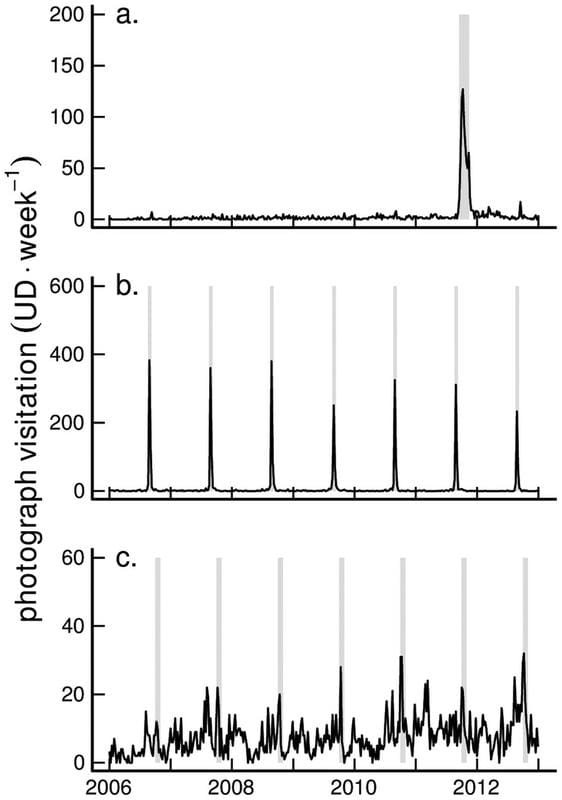
The researchers examined the social media method’s ability to visualize visitor patterns by looking at the examples of a) Zuccotti Park in New York (site of the Occupy Wall Street protests), b) Black Rock Desert (the annual site of the Burning Man festival), and c) southern Vermont (an area popular with senior citizens interested in seeing pretty fall leaves). In each graph we can see the number of visitors peak during the one-off protest, annual festival, and fall season respectively.
Source: Scientific Reports, “Using Social Media to Quantify Nature-based Tourism and Recreation”
The authors end their article by acknowledging that using social media to understand visitation rates will not be this simple across sites and may have biases. Surfers, they note, will probably take fewer pictures than hikers. Visitors to local sites may be less likely to share pictures than visitors to faraway and high-profile tourist spots. But they encourage future research using more variables and suggest that other social media, such as geotagged tweets, could help paint a full picture.
The upside of figuring this out is that researchers and park managers could get a real-time idea of the number of visitors and understand where they are visiting from. Since the same social media user can post photos or tweet from multiple locations in one trip, the tourism industry could also better understand people’s full vacations. The downside? Research assistants will have to give up data collection trips to Yosemite in favor of staring at spreadsheets of social media metadata.
To get occasional notifications when we write blog posts, sign up for our email list.