


This post was written by Dan Kopf, Priceonomics Staff Writer
![]()
In 1906, the great scientist and notorious eugenicist, Francis Galton, attended the annual West of England Fat Stock and Poultry Exhibition and conducted an impromptu experiment.
As the author James Surowiecki recounts in his book, The Wisdom of Crowds, while exploring the fair, Galton stumbled upon a weight judging competition. People were asked to guess the weight of an ox after it was “slaughtered and dressed.” A prize would be awarded to those who made the best guess.
Galton was an avowed believer in the stupidity of the masses. Only experts, he thought, could make accurate assessments. Many of the 787 guessers were non-experts.
To demonstrate the foolishness of the crowd, Galton took an average of all of the guesses. The crowd’s guess: 1,197 pounds. The correct answer: 1,198 pounds. Galton was astonished by the accuracy of the estimate, and he admitted it was evidence of the “trustworthiness of a democratic judgment.”
Certainly, the accuracy of the guess is remarkable. But perhaps even more remarkable is the fact that Galton thought to take an average at all.
In today’s world, we are constantly bombarded with averages and medians: the average temperature in New York in April is 52 degrees; Stephen Curry averages 30 points per game; the median household income in the United States is $51,939.
But the concept of taking many different measurements and representing them with one best number is a relatively recent invention. In fact, there are no historical examples of the average or median being used in this manner prior to the 17th Century.
So how did the concept of averages and medians develop? And how did the average triumph as the measurement of our times?
The supremacy of the average over the median has had profound consequences about how we understand data. In many cases, it has led us astray.

Imagine you’re telling a story about four people who sat at the table next to you in a restaurant last night. The four diners looked like they were 20-, 30-, 40-, and 50-years-old. You want to say how old they were. How do you do it?
You say how old they were on average, of course.
The average is central to how people talk about data. It is far and away the most used term for describing a collection of measurements. Technically, the average is what mathematicians call the “arithmetic mean” – the sum of all measurements divided by the number of measurements.
Though it is sometimes used synonymously with the word average, a “mean” is technically a defined as any measure to represent the middle. The word is derived from the Old French “moien,” which means middle and comes from the Latin “medianus”.
The history of the concept of the mean begins with the Greek mathematician Pythagoras. For Pythagoras and his cult of followers, the mean had a rigid definition that has very little to do with how we think of averages today, and it was only used for pure mathematics, not data analysis.
The mean was the middle number of a three-term series, but only when that middle term was in some “equal relation” to the other terms. That equal relation might be that it was equidistant – like 4 in 2, 4, 6 – but it also might mean they were halfway between each other in a geometric progression – like 10 is the middle of 1, 10, 100.
The statistician Churchill Eisenhart explains that, in Ancient Greece, the mean was “not thought of as being in any sense representative of, nor as a substitute” for another set of numbers. It was just a way of thinking about the middle that was useful for mathematical proofs.
Eisenhart spent a decade hunting for the origins of the average and the mean. He had assumed that he would find some use of “representative” means in ancient science. But instead he discovered that most early physics and astronomy relied on crude but “adroitly chosen” measurements, and that there was not a clear prevailing methodology of how to to choose a best estimate among many observations.
Where contemporary scientists often focus on collecting massive amounts of data on which to base their findings – like biologists studying the human genome – earlier scientists were more reliant on theory to choose which of their measures was best.
“This conforms to a conscious tendency of the ancients to reduce the empirical data to the barest minimum,” wrote the historian of astronomy Otto Neugebauer, “because they were well aware of the great insecurity of direct observation.”
For example, the Greek mathematician and astronomer Ptolemy estimated that the angular diameter of the moon was 31’20 using a small number of observations in combination with a theory of the earth’s motion. Today, we know that the diameter is between 29’20 and 34’6 depending on when it is closest or farthest from the Earth. Ptolemy made his assessment with little data, but he had great reason to think that the data he had was accurate.
Eisenhart writes:
… It needs to be appreciated that observation and theory were differently related to each other in antiquity than they are today. Theory, the creation of the mind, reigned supreme, and observations were not understood as specifying “the facts” to which theory must conform, but rather as particular instances that were useful as illustrative examples in the explanation of theory…
Eventually, scientists would start to use a “representative” measure of data points, but it was neither the average nor the median that came first. From antiquity to modern times, another measurement reigned supreme: the midrange.

The great Persian mathematician Al-Biruni was a proponent of the “midrange”.
New scientific tools almost always result from the need to solve a problem in a particular discipline. The need for finding a best value among many measurements was, in large part, motivated by the desire to measure geographic location for navigation.
The 11th Century Iranian “intellectual giant” Al-Biruni was one of the earliest known users of a methodology for finding a representative measure among a set of data points. Al-Biruni wrote that when he had many different measurements and wanted to find the best measurement, he would use the “rule” of his time: find the number in the exact middle of the two most extreme results – what we would now call the midrange. The midrange disregards all numbers besides the maximum and minimum measurements, and finds the average of these two numbers.
Al-Biruni used this methodology for a variety of subjects, including his attempt to work out the longitude of the city of Ghazna, in modern-day Afghanistan, and his studies of the characteristics of metal.
In his deep dive into the history of best value determination, Eisenhart finds a number of 17th and 18th Century uses of the midrange as a way to adjudicate between different measurements. Among others, the midrange was utilized by Isaac Newton and explorers estimating their geographic position.
But over the last several centuries, the midrange has gone out of style. In fact, the term is barely found in modern usage. It has been fully replaced by the mean, and to a lesser extent, the median.
***
By the early 19th Century, using the arithmetic mean/average had become a common method of finding the most representative value from a set of data points. Friedrich Von Gauss, the most brilliant (and petulant) mathematician of his time, explained in 1809:
It has been customary certainly to regard as an axiom the hypothesis that if any quantity has been determined by several direct observations, made under the same circumstance and with equal care, the arithmetical mean of the observed values afford the most probable value, if not rigorously, yet very nearly at least, so that it is always most safe to adhere to it.
How did this happen?
The history is not entirely clear. In his exhaustive study of the issue, Churchill Eisenhart finds the most direct path towards the arithmetic mean in the exciting world of measuring magnetic declination – the variation in the angle of magnetic north from true north. This measurement became extremely important in the Age of Exploration.
Eisenhart finds that until the late 16th Century, most scientists who measured magnetic declination used an ad hoc methodology of determining the best value among their many measurements.
But in 1580, the scientist William Borough seems to have done something different. Borough took eight different measures of declination and, “conferring them altogether”, decided the best value was between 11 ⅓ and 11 ¼ degrees. He likely calculated the arithmetic mean, which was within this range. Yet Borough does not explicitly say this was his methodology.
It is not until 1635 that there is an absolutely clear case of a scientist using an average as a representative value. It was then that the English astronomer Henry Gellibrand took two measurements of declination, one in the morning (11 degrees) and one in the afternoon (11 degrees and 32 minutes), and, deciding on the most likely value, Gellibrand wrote:
So that if we take the arithmeticall (sic) mean, we may probably conclude the [correct measurement] to be about 11 gr. 16 min.
And there we have it. What may be the very first use of the average as an approximation of the truth!
***
In this article, we have referred to the arithmetic mean and average interchangeably. How did they come to be synonymous?
The word average was in use in English around the year 1500 to refer to financial losses from damage done to a ship or shipped cargo. Over the next hundred years, average would come to refer to the equal manner in which those losses were distributed. If, for example, a ship was damaged and the crew had to throw some goods overboard to save weight, the voyage’s investors would take a financial loss equal to their investment – calculated in the same manner as the arithmetic mean. And slowly, the meanings of the average and arithmetic mean merged.
Today, the use of the average/arithmetic mean dominates all other methods for choosing a most representative value out of many measurements. How come? Why not the average’s plucky sibling, the median?

Francis Galton was a champion of the median.
The use of the median – the middle term in a series of data points that splits the data points in half – as a best estimate appears at just about the same time as the arithmetic mean. In 1599, the mathematician Edward Wright, who worked on the problem of determining the normal variation in a compass, was the first known person to recommend its use.
“… when many arrows are shot at a marke, and the marke afterwards taken away, hee may bee thought to worke according to reason, who to find out the place where the marke stood, shall seeke out the middle place amongst all the arrowes: so amongst many observations, the middlemost is likest to come nearest the truth.”
The median was widely used through the nineteenth century, becoming a formal part of data analysis at that time. It was even the preferred best estimate value of the aforementioned Francis Galton, the preeminent data analyst of the 19th Century. In fact, in the weighing of the ox story told at the beginning of this article, he originally analyzed the median as most representative of the crowd’s guesses.
Many analysts, including Galton, prefer the median because it is easier to find manually for small datasets, and because it is more representative of what was mediocre than the average.
***
Yet the median has never surpassed the average in terms of popularity. This is most likely because of the special statistical properties of the average, and its relationship to the normal distribution.
In many cases, when you take a large number of measurements, the resulting data will be what statisticians call “normally distributed”. This means that if you plot the measurements on a graph, the points on the graph will create a pattern that looks like a bell – hence the “bell curve”. Statistics like the heights of human beings, IQ scores and highest temperature by year all fit a normal distribution.
When data is normally distributed, the average will usually be very close to the highest point on the bell curve, and an unusually large number of the measurements will be close to the mean. In fact, there is even a formula to predict just how many of the measurements will be within a certain distance from the average by using the standard deviation – which is found by taking the square root of the average distance of data points from the arithmetic mean.
This means calculating the average offers researchers all sorts of additional insights.
This relationship of the average and standard deviation makes it unique among the measures of best value; the median has no counterpart that is equally useful. The relationship of the average to the normal distribution is an essential part of analyzing experimental data and making statistical inferences. This has led the average to be a central part of statistics and all science that relies on data to make inferences.
The average may also have come to predominate because of the ease with which it is determined by computers. Though the median is simple to find manually for a small set of observations, it is actually more straightforward to write a computer program that calculates the mean. Avid users of Microsoft Excel will be accustomed to the fact that the Median function is not as easily used as the average.
And so through its importance in science and its simplicity for programmers, the average became the dominant representative value in wider culture, even though it may not always be the best measurement.
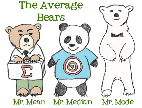
Image by Hannah Holt from Lightbulb Books.
In many cases, perhaps even more often than is the case for the average, the median is the better number to use if you are trying to understand the center of a distribution. This is because the average is significantly more affected by extreme measurements.
Many analysts believe that the unthinking use of the average damages our understanding of quantitative information. This is because when people look at averages, they think it is “the norm”. But in reality, it might be highly impacted by just one huge outlier.
Imagine an analyst who wanted to know the representative value for the cost of real estate on a block with five houses. Four of the houses are worth $100,000 and one is worth $900,000. Given these numbers, the average would be $200,000 and the median $100,000. In this case, and many others, the median gives you a better sense of what is “typical”.
Recognizing the huge impact a small number of extreme values – or a skewed distribution – can have on the average, the U.S. Census primarily uses the median to present changes in family incomes. This methodology deemphasizes the growth in income of people in the top 1%.
The median is also less sensitive to the dirty data that many analysts deal with today. As statisticians and data analysts increasingly collect data from surveys and scraping the web, user error when entering data can have a larger impact on results. When a user accidentally adds an extra zero that changes an answer from 100 to 1,000, it is much more likely to impact the average than the median.
***
The choice between medians and averages has wide ranging consequences – from our understanding of the impact of medicine to our beliefs about whether our financial situation is typical.
As data collection and analysis become an increasingly large part of how we understand the world, the measures we use to understand vast amounts of data become more important. In a perfect world, analysts would present the mean, median, and mode—and graphically represent the data.
But we live in a world of limited time and limited attention, and given those limitations, it is often necessary to choose one number. In those cases, the median is generally the safer default.
The relatively short history of choosing a best value to represent many measurements led to the preeminence of the average. But it’s probably time for a change.
Our next post investigates “mixed-attractiveness” couples. To get notified when we post it → join our email list.
![]()
Note: If you’re a company that wants to work with Priceonomics to turn your data into great stories, learn more about the Priceonomics Data Studio.