Data Visualization
-
A Study comparing 2006 to 2018 acceptance rates at America's top colleges.
-
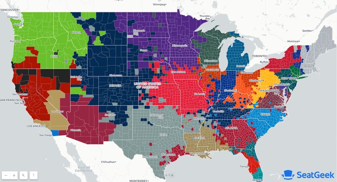
Mapping the boundaries of NFL fandom via an interactive map.
-
At what age are you likely to get a sport car versus a minivan? And which brands have the oldest and youngest buyers?
-
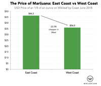
Marijuana is 22.5% cheaper on the West Coast than East.
-
500 billion plastic bags are used per year around the world. Here's where they've been banned.
-
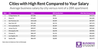
An analysis of how much the typical "business" job pays in a city versus rent.
-
While companies lost a lot of followers during the Twitter bot purge, some companies gained a lot.
-
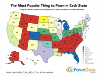
Guns, rings, and steel (watches): here's what Americans pawn across the country.
-
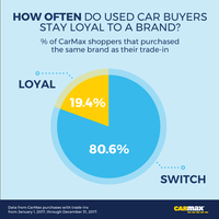
Which car brands do consumers keep buying and which ones do they switch away from?
-
The places where there are more (and less) police shootings than models based on how dangerous the cities are would predict.
-
The places most likely to flood when sea levels rise, and the ones where the homes are most expensive.
-
How much do CEOs get paid and is there a correlation between their pay and high growth?
-
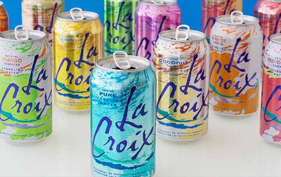
People like LaCroix sparking water. A lot. The most popular flavor? Grapefruit...
-
How long does it take to complete work in different industries and companies sizes?
-
Make and embed charts with your logo on them. A free tool from Priceonomics.


